.webp)
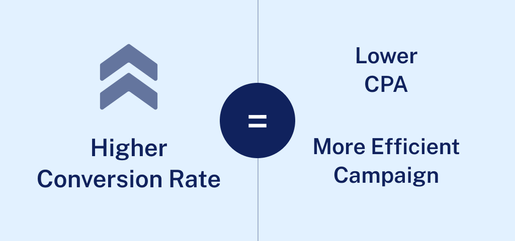
We know the feeling. Thousands of visitors land at your site every day, but most of them simply do not buy anything. Have you ever wondered why and, more importantly, how to fix it?
Here's a truth that might surprise you: Doubling your website's conversion rate is easier than you think. Imagine if, instead of 19 out of 20 visitors leaving empty-handed, you could reduce that number to 17 or even fewer.
No matter how immaterial you might believe this difference is, this is what transforms your business at the end of the day.
Consider this: if your online store is attracting 10,000 visitors a month with a 5% conversion rate, you're making 500 sales. By nudging that rate up to just 5.5%, you gain an additional 50 sales monthly. Assuming an average order value of $180, that’s an extra $9,000 in revenue every month, or $108,000 annually.
Now factor in your profit margins. Do you still believe that this is insignificant?
Getting inside the minds of online shoppers isn't as straightforward as you might think. After years of detailed studying and practical experience, we've uncovered that the best product doesn't always skyrocket in sales just because it is the best.
So, let's cut through the fluff. Practical insights, not just concepts, are what you need to make a real difference. We're not just diagnosing the "why" behind poor conversion rates; we're unlocking the "how."
Conversion Rate Optimization (CRO) in eCommerce: Why Is It So Important?
In the eCommerce world, getting your conversion rate right is much more than just a nice-to-have. It is the science behind every click and purchase. Using both your gut and hard facts, you must determine what makes your customer proceed all the way down to the payment section (and not bounce off to another tab).
In this chapter, we explore how to calculate your site's conversion rate, understand what qualifies as a 'good' rate, and demonstrate the effectiveness of A/B testing We’re looking at CRO through a microscope; this is a blend of smart guesses and solid data to balance the costs of acquisition and customer expenditure.
Conversion Rate: What Is It and How Can It Be Measured?
Understanding your eCommerce site's conversion rate is the most important number you will need. This metric, simple yet profound, offers an X-ray of your business performance by revealing the percentage of visitors who take a desired action.
Think of it like this: Imagine you throw a big party and 100 people show up. If five of them bring you a gift, your party’s “gift conversion rate” would be 5%. Similarly, if 100 visitors come to your website and 5 make a purchase, your site’s conversion rate is also 5%.
Definition of the Conversion Rate
In case you're looking for the textbook definition, here it is also:
The ratio of total conversions to total visits. This value is expressed as a percentage. It measures the effectiveness of your site in encouraging visitors, whether that’s making a purchase, signing up for a newsletter, or completing a form.
Why Does It Matter Anyway?
- ROI impact: It is a key driver of return on investment (ROI) for all marketing efforts. A higher conversion rate directly translates to a higher return on your marketing investments, from social media campaigns to Google Ads
- Doubling effect: Doubling your conversion rate (e.g., from 1% to 2%) effectively doubles your revenue, assuming steady traffic levels
- Better customer connection: When your conversion rate goes up, it’s not just about making more sales. It tells you what’s working on your site and what your customers like. This lets you tweak your eCommerce business to meet their needs better, making every visit smoother and more engaging.
How to Calculate the Conversion Rate

To calculate your eCommerce site’s conversion rate, use the following formula:
Total Conversions (divided by) Total Visits to Your Website (multiplied by) 100
Total Conversions: The number of desired actions completed on your site. This includes purchases, newsletter signups, form submissions, depending on the nature of the business and your ultimate operational KPIs.
Total Visits: The number of times people have visited your site within a certain timeframe. It accounts for all sessions, whether they result in conversions or not.
It’s pretty straightforward: you’re measuring how often people make the purchase when they visit your site.
How to Know the Things That Impact Your Conversion Rate?
Before calculating it, understanding what influences your eCommerce conversion rate is crucial. As we already pointed out, it’s much more than just about your website's look or how easy it is to navigate. Here are the essentials:
- Traffic source: People coming from a Google search with a specific product keyword in mind are more likely to buy than those just scrolling through social media
- Marketing focus: Strategies aimed at people ready to buy (think email marketing) generally yield higher conversion rates than broad, awareness-raising campaigns
- Product price: Higher-priced items usually have lower conversion rates than budget-friendly finds, but they make up for it in value per purchase
- Returning customers: The real, pure eCommerce gold. If your product is something people need regularly, expect to see a better conversion rate thanks to loyal shoppers
Is There Such a Thing as a Good Conversion Rate?
When looking at the numbers that show how successful an eCommerce site is, the conversion rate is without a doubt one of the most important ones. But what does a good conversion rate really mean? This question keeps coming up in the minds of business owners.
Benchmark Values
For the majority of online businesses, the average eCommerce conversion rate is somewhere between 2.5% and 3%. This means that about 2 to 3 out of 100 users, even if your eCommerce site is running smoothly, will buy something. Although it may seem modest, in the competitive world of online shopping, keeping this rate up can be quite the challenge.
Set Your Baseline, But Do Not Settle There
For many online stores, achieving a 3% conversion rate is a solid initial goal. It's a benchmark that indicates you're doing several things right—from marketing strategies to the website's overall UX.
Once you hit this target, instead of celebrating, try to go even further while the needle is moving. From this point, you can start to improve your strategy with more advanced conversion rate techniques, making the experiences even more relevant to your users.
What About an 'Optimal' Conversion Rate? Does It Exist?
It depends, but most likely, the answer is no. The average rates can help you figure out what to expect and calculate the optimal conversion rate, but they don't always show the whole story for every business. Any story behind a good, optimal, or ideal conversion rate is one that fits with your business goals and the way the market is doing.
For example, if you sell expensive items that take longer to sell, a slightly lower rate might still be amazing because the average order value is so much higher. Each business has its own CRO story.
Define Success on Your Own Terms
It's important not to just follow the averages for your business. Instead, try to figure out who the specific customers are and set goals that reflect that. What makes your "good" conversion rate different are things like the type of goods you sell, how you set your prices, and the type of people you sell to.
After all, a good conversion rate isn't the finish line, but rather just one part of an ongoing race. It's important to keep trying and improving different parts of your site, from landing pages to the checkout process.
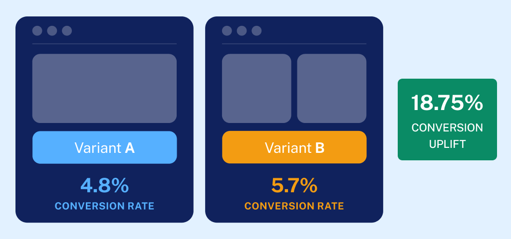
A/B Testing: Why Is It That Important?
If asked, probably every business around the globe will tell you the customer experience is their main tactic on how to have the edge over competitors. That's huge, but much easier said than done.
This isn't just about going with your gut and fine-tuning (plus, it takes a lot of time and money). It's about having real, hard data on what your customers actually want. Yes, but how do you get that data? Well, it's like finding the secret sauce for your favorite burger.
It's called A/B testing.
A/B testing is the closest link between science and conversion rate optimization, with the goal of transforming site visitors into (returning) buyers. You’ve probably heard of this fancy buzzword before, but here’s where you’ll learn everything important about it, from the basics to the best practices that will transform your eCommerce business.
The Basics of A/B Testing
A/B testing, or split testing, allows you to compare two versions of a web page to see which performs better. You might test anything from button colors to call-to-action copy. It's about making informed decisions based on actual user interactions, not just guesses.
Getting Started with A/B Testing
If you're new to A/B testing, here’s your roadmap to check beforehand:
- Identify your goals: What do you want to achieve? More sign-ups, increased sales, or something else?
- Choose what to A/B test: Decide on elements like page layouts, product descriptions, or the checkout process
Then, there is the testing itself, which usually consists of the following steps:
- Create variations: Develop the alternatives for each element you're testing
- Run your test: Direct traffic equally to each version and measure the performance
- Analyze the results: Determine which version achieved the higher conversion rate and why
Key Website Elements You Can Test for a Better Conversion Rate
From your homepage to the checkout, think of every eCommerce webpage as a puzzle piece. In CRO terms, every segment of your eCommerce site can, in fact, be A/B tested to improve conversion rates. Here are a few to consider:
- Page layouts and navigation
- Product pages and descriptions
- CTA buttons and their placement
- Pricing strategies and special offers
The Benefits of A/B Testing
This method of site performance setting does much more than fine tune your site. It provides a slew of advantages:
- Data-driven decisions: Make changes based on what the exact data tells you, not gut feelings
- Risk reduction: Test changes on a small scale before a full rollout, minimizing potential fallout
- Objective results: Let the best-performing changes lead your strategy, regardless of hierarchy or opinion
Plenty of Pros, But Prepare for Problems as Well
While A/B testing is powerful, it comes with challenges:
- Traffic volume: Make sure you have enough visitors to achieve statistically significant results
- Complex analysis: Understand that analyzing A/B test results can require a deep dive into the data
- Constant improvement: A/B testing as an ongoing process, not a one-time fix
Is A/B Testing Worth It?
Of course. If you do A/B testing the right way, it can greatly improve key performance indicators (KPIs) like return on ad spend, customer acquisition cost, ongoing customer value, and more. By constantly improving your website, you get rid of things that stop people from buying, one by one.
Online Consumer Buying Behavior: The Key to Increasing eCommerce Conversion Rates
Any eCommerce business that wants to increase its sales rates will need to have a sort of applied BA in psychology to ascertain how people buy things online. Putting together hints about what makes your customers tick is similar to being a detective.
You can make your plan really work by understanding the psychological, social, and technological factors that affect their choices to buy. So, no throwing darts in the dark, but planning your shots based on where you think the target is most likely to be.
Psychological Triggers: How Consumers Think Affects How Much (and Whether) They’ll Buy

To learn how to improve your eCommerce conversion rate, first you need to understand the very psychology of shopping:
- Engage emotions: Strategies that evoke strong feelings as customers navigate your website can significantly boost your conversion rate. This is because a positive emotional experience creates bonds with your offer and often leads to increased sales
- Understand the human cognitive process: All steps a buyer takes, from realizing they need something to confirming they want to buy it, are your data gold in figuring out what will make your conversion rate skyrocket. Behind this success is a story of effective messaging that fits with how your buyers think
- Create urgency and scarcity: This recipe never gets old. Using urgency and scarcity can immediately increase conversion rates. These strategies are one of the best ways to increase conversion rates because they play on people's fear of missing out
Societal Influences and Their Impact on eCommerce Sales
It has become common wisdom that social factors play a part in online shopping. Behind this formal wording lies the famous story of word-of-mouth marketing. This tactic never gets old and will definitely remain one of the most effective and trusted factors in boosting your conversion rates.
The reasons are numerous:
- Effects of social proof: Adding customer reviews and comments can have a big effect on the average eCommerce conversion rate by giving potential buyers proof that makes them change their minds
- Building community connections: Using social media to interact with customers and putting together communities are good ways to increase sales and conversion rates, keep customers coming back, and get them to buy from you again and again
- Changing with the times: Knowing about new cultural trends can help you make your marketing more effective, which is very important for improving your sales
- Culture influences consumer behavior: There are visible and invisible rules dictating what is acceptable or preferred in a society. For instance, in cultures where thrift is valued, consumers might prefer cost-effective products and value deals
- Family influence: Our spouse, parent or closest relatives often influence our purchasing decisions. Marketing strategies that target families can encourage group decisions that favor bulk purchases or products that meet the collective needs of a family
- Reference groups and peer pressure: Your customers' social circles, including friends, colleagues, and social media networks, greatly influence their purchasing decisions. Using influencers to endorse products or creating buzz through social media can effectively sway potential buyers
- Class position and consumer pattern: The social class has an impact on consumer preferences and purchasing behavior. Luxury brands often target upper classes with exclusive marketing, while mass-market brands might focus on broader appeal and accessibility.
How Demographics Influence Consumer Choices and Your Conversion Rate
Personal traits like age, income, gender, lifestyle, and attitude all have a big impact on what people like and how they buy things, which makes them very important for targeted marketing.
- Age and consumer needs: Younger people might be interested in the newest tech gadgets or fashion trends, while older ones tend to buy things that will last and be useful. To get more people to buy from your business, make sure your marketing messages are specific to these needs
- Income and purchasing power: Your website’s visitors with higher incomes might not think twice about spending a lot of money on high-end or luxury items, while people less well off might look for the best deals or discounts and prioritize cost. That said, be careful with ad campaigning
- Gender preferences: The shopping habits of men and women are often different, which can affect the choices of products and advertising methods. Men might be more interested in tech goods and sports gear, while women might like shopping for clothes and beauty products
- Lifestyle and buying habits: The way someone lives has a big effect on the things they buy. A person who likes to work out is likely to spend money on health and wellness goods, while someone who likes to stay at home might spend more on home decor or entertainment.
Psychological Factors Influencing Sales and Conversion
The psychological aspects of consumer behavior include motivation, perception, learning, beliefs, and attitudes, all of which play a critical role in how - and whether at all - your site visitors decide to purchase:
- Motivation and needs: Understanding what motivates consumers to make a purchase is key. For instance, a customer who is interested in prestige might be drawn to high-end brands, while a customer who is interested in functionality might look for goods that are durable and useful
- Perception and brand image: How people view a product or brand has a big impact on their decision to buy it. A clear, positive message and good branding can improve how people think about a product or service and make them more likely to buy it
- The learning factor: Your customers learn from previous interactions with you. If you have a good experience with a product, you're more likely to buy it again, but in the case of the opposite, your customer’s lifetime value might have come to an end
The Power of Storytelling in CRO
In digital marketing as well as eCommerce, storytelling is more powerful than standard advertising because it makes people have authentic feelings, which changes the way they perceive and behave as shoppers and elevates the entire conversion rate optimization.
So the benefits of this approach are pretty self-explanatory: they not only get people's attention but also help them build lasting relationships with your brand and offer. It is the old story of increasing trust and engagement.
Here's how adding stories to your website’s content can make it stand out and turn casual users into loyal customers.
Crafting Connections Through Storytelling
Effective storytelling, when applied to increase your conversion rates, serves to help customers identify themselves with your offer, and there are several ways:
- Illustrating product benefits through stories: Rather than listing features, describe how your product makes the lives of your customers easier every day. We all know this is the rule of thumb for effective copywriting, but it is often neglected
- Enrich product descriptions with scenarios: Use scenarios to highlight the practicality and effectiveness of your products. For instance, if you sell kitchen gadgets, tell a story about a family holiday dinner that was made easier and more enjoyable by your product
- Induce emotional engagement: Connect with customers by tapping into emotions like joy, relief, or satisfaction that come from using your products. Narratives that evoke such feelings can make shopping more persuasive and will definitely result in a better conversion
Build Trust with Authentic Stories
Trust is a crucial approach to converting visitors into buyers, and authentic storytelling plays a key role in fostering this trust. Imagine a customer who is hesitant to buy a high-end item like a laptop. Sharing a detailed story about how another customer successfully used this laptop to start their own small business can reassure and motivate them to complete the purchase.
And there are plenty of other secrets to this approach. To name a few:
- Customer testimonials as stories: Instead of reviews, increased conversion came from showing customer comments that are more like stories about their experiences with your brand. For instance, a video testimonial that shows a real-life customer using your product can be more convincing than written reviews
- Behind-the-scenes looks: Tell stories behind the production process, the individuals involved, and the brand's guiding principles. This transparency can build trust and deepen the emotional connection customers feel towards your brand, often tipping the scales in favor of a purchase
- Narrative-driven case studies: Use detailed case studies to tell the story of how your product solved a problem. Highlight before-and-after scenarios to showcase tangible results, underscoring the value of your offering and reinforcing the decision to buy
The Importance of Web Design for Increasing CRO
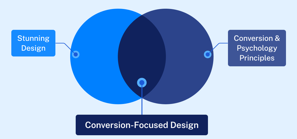
A quality web design is often confused with the importance of “looking good.” Although this segment is also very important, its primary role is the effect it has on conversion rate optimization (CRO). A well-designed website makes it easy for people to use, which can greatly increase the chances of turning viewers into customers.
This segment analyzes the positive impact of elements like responsive design, easy-to-use navigation, powerful visual elements, and fast website loading times on improving the user experience and increasing sales rates.
The Role of Easy Site Navigation in the User Experience
A clear and intuitive website navigation is essential for keeping potential customers engaged and guiding them smoothly towards conversion. This CRO element consists of several crucial components:
- Simplify navigation menus: People may leave a site if the navigation is hard to use or understand. Your eCommerce navigation menu should only contain the most important items. This will make it easier for people to find what they're looking for without getting too confused.
- Logical page hierarchy: Set up a clear order for your content and use breadcrumbs to help visitors understand and get around your site's structure. This makes the site easier to use and helps with SEO by making the site's design clearer for search engines
- Interactive elements equals better user engagement: Incorporate interactive elements like hover effects or dynamic menus that respond to user actions, which can make navigation more engaging and intuitive
How to Optimize Web Design Elements for Maximum CRO Impact?
The visual and functional aspects of your website’s design directly influence conversion rates by affecting how users perceive and interact with your offer. That is why it is very important to pay attention to the following:
- Responsive design: Ensure your site is accessible and aesthetically pleasing on all devices. A responsive design adjusts seamlessly to different screen sizes, benefiting the user experience and accessibility. The likelihood of conversion is now substantially higher
- Optimize loading speed: To keep users engaged, website speed is of the utmost importance. Pages that take a long time to load can cause user frustration and high bounce rates. To speed up load times, optimize images, clean up code, and use browser caching
- Pay attention to visual appeal and readability: Use an appealing color scheme and readable fonts to make browsing your site enjoyable. Proper use of white space can help focus users’ attention on key elements like calls to action and special offers.
- Compelling CTAs convert better: Design CTAs that are easy to find and compelling enough to click. Use vibrant colors that stand out from the rest of the page and action-oriented language that prompts users to take the next step
Color Psychology: The Science Behind Shades in CRO
Understanding color psychology is essential for any eCommerce owner or professional manager aiming to boost conversion rates through thoughtful design. Colors are much more than mere visual aesthetics; they trigger emotional responses that can significantly influence buyer behavior.
Primary Colors and Their Impact on Buyer Emotions
Primary colors—red, yellow, and blue—are foundational in the color spectrum and play pivotal roles in attracting and retaining customer attention:
- Red: Known for its intensity, red can evoke feelings of urgency and excitement. It's often used in clearance sales and call-to-action buttons to stimulate quick responses from shoppers
- Yellow: This color is synonymous with happiness and light. Its bright hue can help create a welcoming and energetic vibe on a website, encouraging browsing and exploration. Ideal for landing pages
- Blue: Trusted and calming, blue is favored by the financial and healthcare industries to accentuate trust and security
The Influence of Secondary and Tertiary Colors
Mixing primary colors gives rise to secondary colors—orange, green, and purple. Each of them have its own unique benefits in eCommerce, depending on the intended consumer behavior:
- Orange: A blend of red’s passion and yellow’s joy, orange is perfect for calls to action that require enthusiasm but not the urgency associated with red
- Green: Often associated with nature and tranquility, green is ideal for promoting environmental and health-related products
- Purple: As a color that mixes the calmness of blue and the fierceness of red, purple is excellent for brands that want to portray luxury or creativity
Strategic Application of Color in eCommerce: Important to Know
Implementing color psychology effectively requires strategic thinking and an understanding of the target audience and its preferences:
- Cultural considerations: Colors have different meanings in various cultures. For instance, while white is associated with purity in many Western cultures, it symbolizes mourning in some Eastern societies. eCommerce sites that serve customers all over the world need to take these differences into account to keep people from getting confused
- Contextual use: Colors' impact can drastically change depending on the context. For example, black might be great for luxury products but less appealing for a health food store
- Combining colors: The right combination of colors directly increases the overall website usability and aesthetic appeal. Contrasting colors can be used for buttons to make them stand out, while complementary colors can create a balanced and harmonious look
The Future of CRO: Integration With AI, SEO, and PPC
As digital marketing evolves, the integration of AI, SEO, and PPC with Conversion Rate Optimization (CRO) is reshaping how businesses optimize their operation to maximize growth.
This section explains how AI complements traditional CRO strategies, solidifies SEO efforts, and synergizes with PPC campaigns. We’ll explore the expanding role of AI in digital marketing, recognize its growing influence, and discuss the balance needed between automation and human creativity and insight.
AI's Role in Improving CRO: Opportunities and Limitations
AI technologies are now a big part of increasing conversion rates. They offer tools that can look at huge amounts of data, guess how users will act, and personalize content automatically.
However, recent CRO-related studies have shown that large language models (LLMs) can reveal up to 80% of the false-positive error rate in CRO audits. This indicates that AI still struggles with the nuanced understanding that experienced human professionals can offer.
There are indisputable advantages to AI in CRO:
- Data processing: AI can handle and analyze data at a scale unmanageable for humans, providing insights based on user interaction patterns across multiple channels
- Predictive analytics: AI algorithms can forecast future buying behaviors based on historical data, allowing for proactive adjustments to marketing strategies in real time
- Automation: AI can automate repetitive tasks such as A/B testing and personalization, increasing efficiency and consistency
However, AI is still unable to optimize your CRO effectively in the following segments:
- It struggles with contextual understanding: AI in general may not fully understand the context of user interactions, leading to recommendations that are not always applicable or effective
- Overly reliant on quantitative data: In practice, this means it may fall short on qualitative insights that can only be captured through human intuition and interaction
- High rate of irrelevant suggestions: This can translate into a vast number of wasting resources and potentially detracting from the user experience
Humans and AI: Joining Forces for the Future of CRO
The facts presented indicate the challenge for marketers will be to strike the right balance between leveraging AI's capabilities and maintaining the irreplaceable human touch in CRO. Choosing one over the other is not an option, but understanding how to use each one effectively in different scenarios.
Balancing Automation and Human Creativity
As the world of CRO evolves each day, combining AI automation with human creativity is not only helpful, but also essential. Here are some of the best scenarios in which they could work together:
- Ethical considerations and transparency: As AI becomes more involved in decision-making processes, ensure transparency in how AI algorithms influence these decisions in practice
- Learn and adapt - non stop: Both AI systems as large language models and human marketers need to continuously learn from each other and adapt based on new insights and market trends
- Full collaborative mode: Together, AI's data-crunching skills and a CRO expert's intuitive knowledge will allow your business to fine-tune website elements, such as changing the CTA segment based on patterns of visitor behavior, to really boost conversion rates
SEO and CRO: One Sets the Stage, the Other Closes the Deal
It might seem like SEO and CRO are two distinct techniques, but they should — and indeed must — work hand-in-hand to attract visitors to your website and convert them into customers.
With Google's latest update, user experience (UX) has become an even more important factor for ranking. The update emphasizes the importance of creating an user interface that is centered around usability and maximum user engagement. That is why a holistic approach that combines SEO and CRO is essential.
Consider an online bookstore. Through diligent SEO efforts, the bookstore ranks well for searches like "buy contemporary fiction books online." Because the store appears at the top of search results, potential customers click through. However, the real test begins once they land on the site. Here's where CRO comes into play.
If the site is well-designed, with clear categories, engaging descriptions, and an easy checkout process, visitors are more likely to make a purchase. In essence, SEO draws them in, and CRO makes them stay and buy.
Understanding the Synergy Between SEO and CRO With Google's UX Focus

SEO brings visitors to your site by improving your visibility in search engine results. CRO, on the other hand, optimizes your site to convert those visitors into leads or customers. While SEO expands your audience, CRO ensures that your traffic isn't just a number—it's a potential customer walking through your digital door.
SEO draws visitors in, and CRO, reinforced by the latest SEO trends and Google updates focused on UX, makes them stay and buy.
Another real-life business example: Imagine your website as a trendy cafe. SEO is like the inviting aroma that lures people in, while CRO is the friendly service and irresistible menu that keep them seated and ordering. Without both working in harmony, the cafe might either be packed with people not buying or empty but perfectly set up for guests.
Google’s algorithms are trained on trillions of user interactions, tracking and ranking your website usability factors that are tied to positive user experience. Google measures these factors directly via the Google crawler/bot when it visits your site.
This includes things like whether or not your site uses design elements known to be distracting, (for example pop-ups), how easy it is to find elements for establishing trust and credibility, like author bios or your site’s privacy policy, and one of the biggest factors - how quickly all of these elements load and the overall page loading speed.
The Benefits of Higher Conversion Rates on SEO Rankings
Google recognizes higher conversion rates as indicative of high quality user experience and rewards such sites with better rankings. This shift means that CRO isn't just about optimizing for more sales or leads—it's directly influencing how your site is perceived and ranked by search engines.
This paradigm shift shows how the connection between customer satisfaction and SEO is changing. It also shows how important it is to combine SEO and CRO to improve website performance as a whole.
The Practical Formula: Crafting Content That Ranks and Converts
- Match content with search intent: To dominate in SEO and CRO, start with content that aligns with what your users are searching for. This means if someone’s looking for "how to fix a leaky faucet," your content should not only provide the steps but also suggest tools or services, leading them towards a conversion.
- Actionable tips: Use tools like Google’s famous "People also ask" and related searches to understand what your audience expects from your content. This allows you to craft content that satisfies their queries and nudges them towards making a purchase or signing up.
- Optimize for conversions: Once your content gets the clicks, it's all about keeping the user engaged and guiding them to the next step. This could mean strategically placing call-to-action (CTA) buttons or links within informative content that leads them to related products or booking forms.
For example, a blog post about the best winter tires can include a CTA like "Browse our top-rated winter tires" halfway through and at the end. It makes it easy for consumers to see products after reading useful content, which increases the chances of a conversion.
Seamless Mobile Experience and Conversion - It Is a Must
With over half of web traffic coming from mobile devices, optimizing your content for mobile is non-negotiable. A mobile-friendly site not only supports your SEO efforts by meeting Google's mobile-first indexing standards, but also contributes to the user experience, increasing the likelihood of converting mobile visitors.
Ensure your most crucial conversion elements are visible without scrolling on mobile devices. This might mean placing product prices, add-to-cart buttons, and compelling calls-to-action like "Order Now to Receive by Friday" above the fold.
Balancing Technical SEO and User Experience
Technical SEO ensures that search engines love your site, while CRO makes sure the same goes to the very visitors your business depends on. To achieve this, ensure that the following settings are correct:
- Optimize title tags and meta descriptions: These elements influence both your search ranking and whether someone decides to click on your link. Make them clear, compelling, and reflective of the content on the page.
- Improve page loading time: Speed is a critical factor for both SEO and CRO. A fast-loading page improves the user experience, reduces bounce rates, and results in increased overall site performance in search rankings.
CRO is all about 'removing friction' in the UX segment. To put it simply: making your site easier to use from Google’s perspective.
Whether it’s removing friction by making a page load faster, or establishing trust, adding credibility elements to a page like a prominent author bio or awards your organization has won, an experienced CRO specialist will know all of these are important web design elements that will not only make your site easier to use, but also maximize your conversions.
Remember, the end goal is not just to attract visitors but to convert them into loyal customers.
CRO and PPC: A Power Duo for Boosting Business Performance
Imagine turbocharging your marketing efforts so that every click not only brings a visitor but also turns them into a customer. Combining PPC and CRO can do exactly that, turning your website into a high-performance engine that maximizes both traffic and conversions. And here is how.
Syncing PPC and CRO for Maximum Conversion
While PPC (Pay-Per-Click) advertising excels at pulling in traffic, CRO (Conversion Rate Optimization) is all about converting that traffic into leads and sales. When you harmonize the logic and goals of both strategies, you create a powerhouse that attracts visitors and effectively converts them into longtime customers.
The Synergy of PPC and CRO in Practice
Let’s say you’re running a PPC campaign that’s successfully driving a lot of traffic to your product page. But what if those visitors aren't converting into sales? That’s where CRO comes into play. By analyzing data from your PPC campaigns, you can fine-tune the elements of your product pages to increase conversion rates significantly.
If your ad highlights a specific feature of your product but your product page doesn’t make this feature immediately apparent, adjustments can be made to align these elements more closely, thus boosting conversions.
With CRO tactics, the business tests different layouts that highlight customer reviews and simplifies the checkout process. With this approach, they can see up to 20% increase in conversions, proving once again the power of aligning PPC with CRO strategies.
Data-Driven Decision Making
Both PPC and CRO thrive on data. By analyzing the performance data from PPC campaigns, such as which ads bring the most traffic and what keywords are most effective, you can identify which aspects of your webpage need refining. Integrating these insights into CRO efforts ensures that not only the traffic is constantly increasing, but customers also take the desired actions once they land on your page.
Test (Followed by More Testing) for Lasting Results
A few changes won't end the connection between PPC and CRO. It's about learning and improving all the time. As customer habits and market trends change, the constant testing and data feedback loop from both PPC and CRO activities keep you ahead of the curve. This way, you can make sure that your website not only gets visitors but also converts them at a high rate.
devider line
Proven & Practical eCommerce CRO Guidelines
Our years of hands-on experience have shaped the creation of these eCommerce CRO guidelines. We have built this guide on a solid foundation of A/B testing, continuous learning, and working closely with other professionals.
Our insights come from direct interaction with users and applying what we've learned in real-world eCommerce shops. We have tested and refined the practical strategies packed in this guide. It's more than just tips and tricks; it's the essence of what we've learned about boosting eCommerce conversion rates.
We've compiled a list of 32 targeted tips, focusing on three important parts of your eCommerce website:
We delve into strategies that significantly boost conversion rates on product pages. Our guidelines are designed to turn browsing into buying.
Homepage & Category Navigation (10 Guidelines)
Our guidelines will help your visitors find their way around easily, leading them in the right direction.
And we're not going to stop here. We plan to expand our guidance to include other important areas like category pages, filtering, navigation, and accessibility. Keep an eye out for these new sections – there's always more to learn and optimize.
Product Page CRO Guidelines
In this section, we'll dive into nine key areas that are essential for optimizing your product pages. Each category is designed to tackle a specific aspect of your page, helping you increase conversion rates:
Focus on how to structure your product page for maximum impact and user engagement.
Tips on using visual content to effectively showcase your products.
User Interface for Image Galleries
Best practices for designing an intuitive and attractive image gallery.
Make the 'Buy' section straightforward to ease the purchasing process for your customers.
How to present shipping and return information clearly to build trust and reduce hesitations.
Crafting compelling product description that sell.
Managing product variations in a way that's easy for customers to navigate.
Leveraging user reviews to provide social proof and increase buyer confidence.
Strategies to effectively suggest additional products that complement the user's current selection.
Product Page Layout
The layout of your product page is crucial. A poor layout can lead to a bad user experience and lower conversion rates. We've seen in our tests that even with great content, a confusing layout causes users to leave. A well-executed layout, however, helps users easily find and use what they need, boosting overall performance. Remember, no matter how good your images, descriptions, or reviews are, they won't work well on a poorly designed page layout.
Consider Using Collapsible Sections for the Product Page Layout
We've seen that using vertically collapsed sections on product pages can significantly impact the user experience. This layout makes it easier for users to quickly get an overview of all content, without the need to scroll through the entire page.
- Lengthy, uncollapsed sections make it difficult for users to swiftly read the product pages
- Mixed use of collapsible and non-collapsible sections leads to navigation issues
- Implement collapsible sections across the board for a neat, easy-to-navigate layout
- Each collapsible section should have distinct, clear titles to help users find what they need
If you're using collapsible sections, ensure all content types like descriptions, reviews, and specifications are uniformly collapsed for consistency.


When using collapsible sections, ensure they are applied to all main content sections. Cabela's utilized both collapsible and non-collapsible sections, which can make the collapsible sections easy to overlook.
.png)

.svg)
Argos uses collapsible sections for key page content, so users can quickly scan what's there and read what interests them. Cross-sell section is not part of the main product content. Tip: Display the review number and star overview.
Consider Using a Long Page Layout with a Sticky Table of Contents for Easy Navigation
When exploring content, scrolling is easier than clicking. However, we should still facilitate easy user navigation by implementing a sticky table of contents. Without it, they might miss the big picture and overlook important sections.
- Long pages without a sticky table of contents make it hard to track page contents, causing oversight
- Users often skip sections on long pages due to a lack of clear navigation
- A "Sticky TOC" ensures easy navigation and access to all sections on long pages.
Design the sticky table of contents to highlight the current section, helping users track their progress on the page.

While Satechi's product page content is engaging and informative, it lacks a content overview. A sticky table of contents would be a solution.
On its product page, HP uses a sticky header with basic product info, an add-to-cart button, and, most importantly, a table of contents (which provides users with a page overview).
Don’t Use Horizontal Tabs for the Product Page Layout
Horizontal tabs on product pages tend to perform poorly. Users often overlook them and may miss crucial product details.
- About one third of users miss crucial details on pages with 'Horizontal Tabs' due to poor discoverability
- Short, unclear tab titles lead to confusion, leaving users unsure about the available content
- Replace horizontal tabs with collapsible sections or a long page layout with a sticky table of contents for better navigation
- For simple, visually-driven products, a plain, long page layout works well

Academy's Product Page hides reviews and Q&A in horizontal tabs, leading many users to overlook these important sections. There are no positive examples of how to effectively use horizontal tabs.

Due to poor performance, there are no good examples of horizontal tabs being used effectively.
For simple, visually driven products, consider a long page layout
Simple, visually driven products, such as basic shoes or art, benefit from a long page layout, avoiding complex navigation.
- Complex in-page navigation is overkill for products with minimal content
- Excessive navigation leads to user frustration on simple product pages
- Use a 'One Long Page' layout for products with limited information
- Ensure content is well organized and not just a 'wall of text' on long pages
For products with limited details, a long page layout without a sticky TOC works best. Ensure all content, no matter how minimal, is logically grouped and easy to scan.
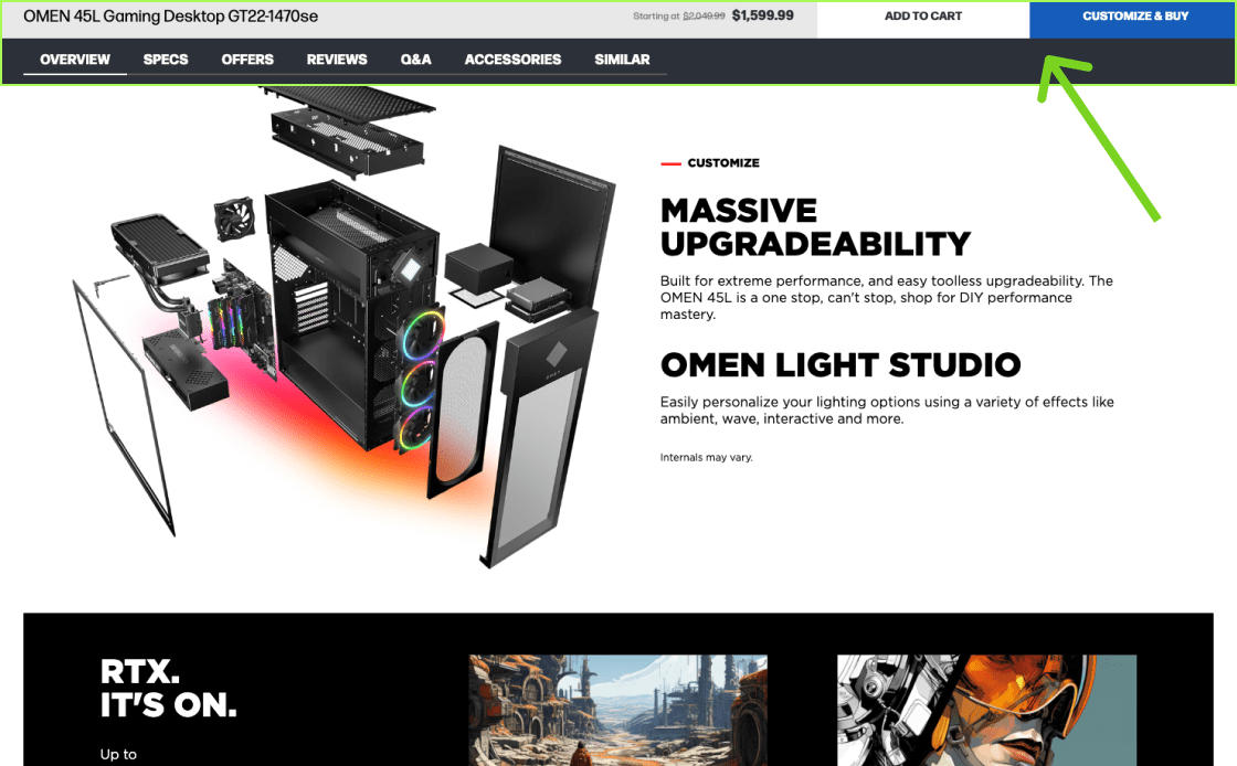
GameStop uses a 'One Long Page' layout for spec-driven products, complicating navigation and overwhelming users with dense and illegible information.
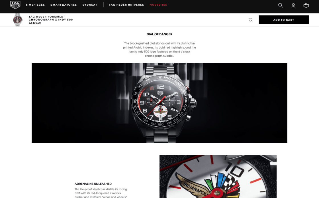
TAG Heuer's watch is displayed with sticky navigation but without sticky TOC throughout the product pages.
Images & Videos of Products
The presentation of images and videos on your product pages is crucial. In our experience, even top-notch products often underperform in sales due to poor visual representation. Well-arranged images and videos result in visitors having a thorough understanding and website engagement, significantly boosting conversions. How well your products are visually showcased heavily influences their appeal, regardless of their quality. A smart, credible, and user-centric display of images and videos can make all the difference in converting visitors into customers.
Always Have at Least 4-6 Product Images for All Products
The importance of a variety of high-quality pictures for each item can’t be overstated. People naturally learn best by seeing things rather than reading about them. Users can fully understand a product's features with high-resolution pictures. Well-placed, high-quality pictures in a gallery make it much more likely that people will make purchasing decisions.
- Product photos are insufficient, lacking in variety or quality. The key element for shaping a visitor’s positive first impression and influencing their purchasing decision is lost
- Inadequate visual content means customers will question the product's key features and reliability
- Consistently offer 4-6 high-quality images for each product, with special attention to top-selling and key items
- Ensure a mix of image types, including "in scale" shots, detailed feature highlights, and various angles, to provide a complete visual perspective
Your desktop interface should include photographs of a product in use, important feature close-ups, and different angle viewpoints to improve product clarity and purchasing confidence.
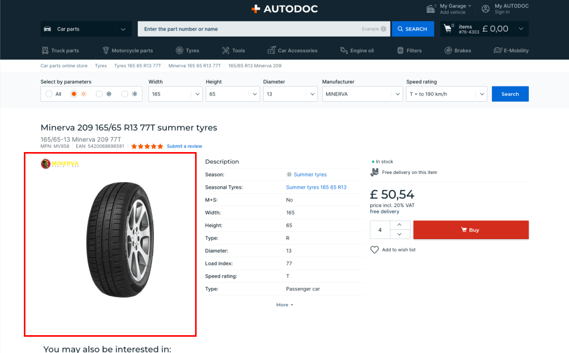
AutoDoc's single-image product pages limit visual exploration and user engagement, preventing the buildup of visitor confidence and increasing the likelihood of leaving the page without purchase.
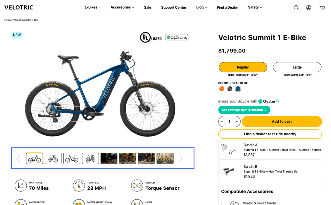
Velotric excels with eight detailed images per product, enabling a visual product exploration equivalent to in-store experience. This optimizes customer understanding and satisfaction, boosts confidence and results in higher conversion rates.
Consistently Display Products with 'In Scale' Images
Incorporating 'In Scale' images on product pages is crucial for giving customers a realistic and accurate perception of a product's size. This is especially important, as measuring and visualizing product dimensions is far more challenging in a digital environment than in a physical retail setting.
- Traditional “cut-out” images often mislead users, making it difficult to accurately gauge product size
- Lack of 'In Scale' images typically results in users misjudging product size, affecting their buying decisions and potential increase in customer returns
- Users find it challenging to perceive the product's actual size in a typical use environment
- Include at least one 'in scale' image to help users understand the product's actual size and fit
- Depict products in familiar settings or alongside known objects to provide a relatable sense of size
- Where possible, show the product being held or used by a person to offer a real-life dimension perspective
Employ real-life context 'In Scale' images, from quality photographs or models in a typical use or CGI for large catalogs. Product videos are preferable, but only as supplementary content.
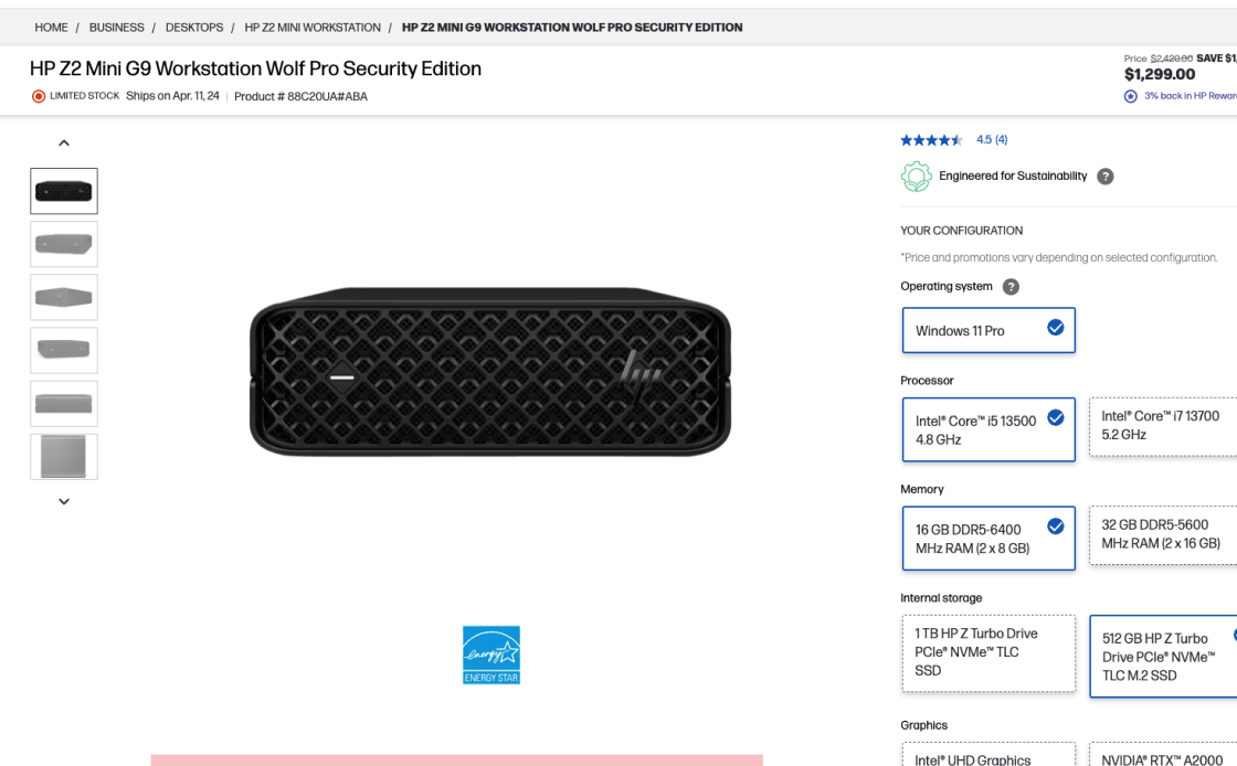
HP's product pages lack 'In Scale' images, causing visitors to struggle with size assessment and often abandon purchases due to uncertain item dimensions.
Build's pages feature 'In Scale', realistic product images, allowing users to precisely gauge size in typical use, thus boosting confidence in purchase decisions.
Include Product Videos in the Main Image Gallery for More Visitor Views
Placing product videos in the main gallery is crucial for a better shopping view, helping customers quickly find and understand all the product details and insights.
- Users often overlook product videos when they're not easily visible in the main image gallery
- Placing videos in separate tabs or distant sections leads to lower visibility and engagement among website visitors
- Users will confuse video thumbnails for additional images if they lack clear indicators, such as the play button
- Place product videos directly within the main image gallery alongside image thumbnails, as it is easier to find them
- Ensure product videos are easily accessible and visible in the primary visual area of the product page
- Use distinct "play" icons on video thumbnails to clearly differentiate them from images
Position product videos in the main gallery, marked by 'play' icons for distinct visibility and effortless navigation, which significantly boosts user engagement.
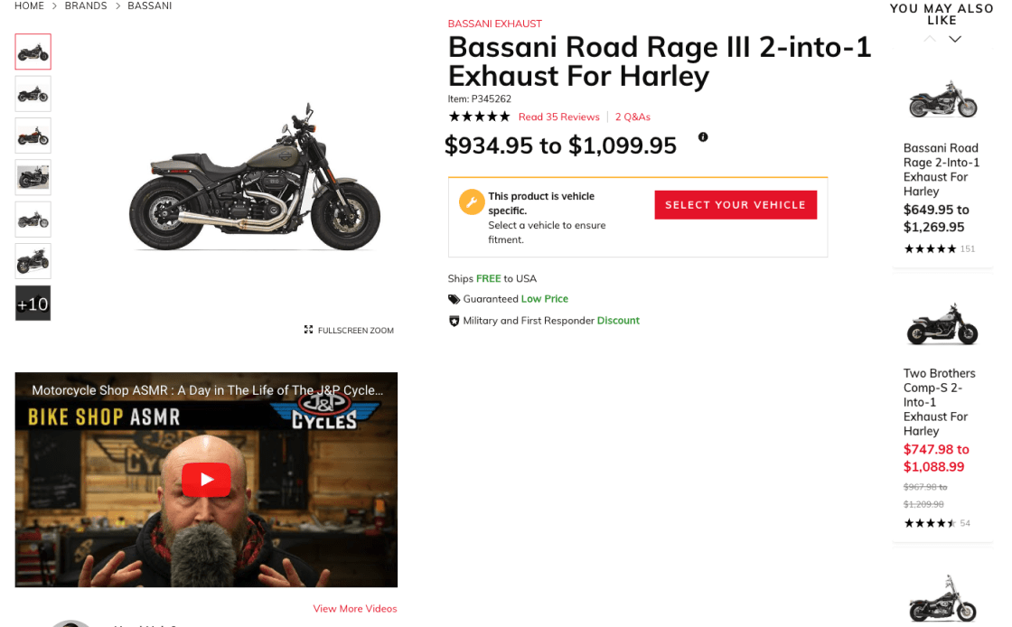
J&P Cycles displays product videos below the gallery. While visible, positioning them within the gallery would increase visibility, make better use of space and optimize user engagement.
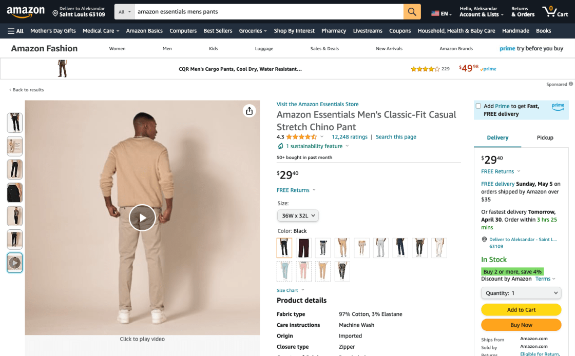
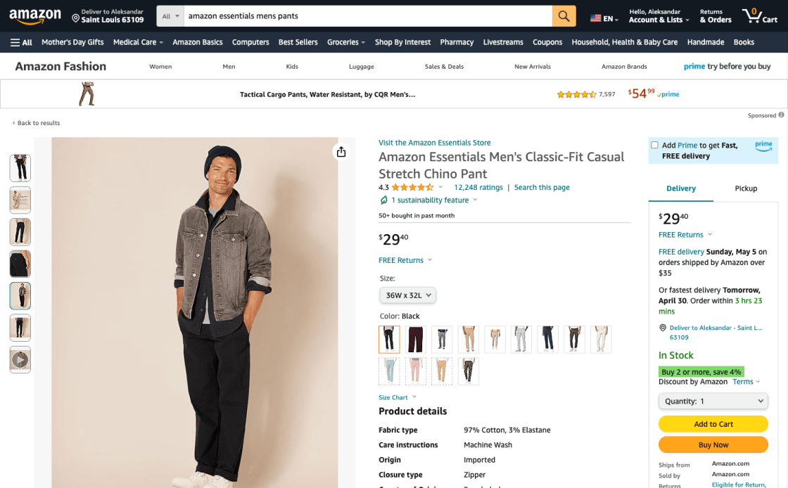
Amazon displays product videos in the main gallery, clearly marked with 'play' icons. This layout is user-friendly, making it easy to find and understand products. Their approach of mixing videos with images boosts user engagement and simplifies navigation.
User Interface for Image Galleries
The product image galleries must have an easy-to-use and well-designed interface, as this has a big effect on how people use and think about products. A gallery layout that is easy to use helps the site visitor see the product better and become more interested in making a purchase. Any eCommerce site that wants to increase sales needs to carefully design these layouts so that users can easily find their way around and understand how products work.
Use Thumbnails to Introduce Additional Product Images
Effectively using thumbnails in product image galleries is critical to improving visitors' website navigation, overall UX, and ensuring all visual information is readily accessible.
- Desktop websites often miss additional product images when there aren’t any thumbnails available. This means important product details are overlooked
- It's difficult to find specific pictures on desktop sites because there aren't any clear signs for more images. This makes visitors less likely to look into the product.
- Small icons often complicate navigation, causing accidental taps and user frustration
- Always use product images with thumbnails in the gallery to ease users access to and understanding of the product
- Clearly indicate there are more images to see to motivate user exploration
Ensure thumbnail visibility and ease of access in product galleries. This helps users find their way around, understand, and connect with the product better.
Microsoft's pages omit any thumbnails. With no navigation, desktop users think there is only one image and struggle to assess the product. This can typically result in a poorly informed purchase.
Lowe uses effective thumbnails, and users can easily switch views and get a full picture of the product, be it the images shown directly on the product page, cut off, or through an overlay.
Ensure HQ Images and Quality Zoom Option Across All Device Galleries
Without the option to physically examine products, online shoppers depend on detailed, high-quality images for a clear visual understanding. That's why it's crucial to offer plenty of product images.
- Low-resolution images are a key friction point, preventing users from getting a good look at items online
- Images that are fuzzy, pixelated, or lacking in clarity make people less confident and more likely to give up on the product
- Make sure that all of your product pictures are high-resolution and show photorealistic details so that customers can look closely at even the smallest details
- Make sure that all devices have better zoom features so that users can easily get to smaller details
Upload high-quality images that can be zoomed in to see fine details, as this is how users can better interact with and understand the product visually. This is how eCommerce websites will look more enjoyable, and visitors will show more interest in the product, resulting in more sales.
Grainger's pages allow a 50% larger photo zoom, but at low resolution, resulting in blurred and pixelated images. This often results in users doubting product features and halting purchases.
Amazon's product pages offer high-resolution photos and clear zoom, increasing images by over 200% and resulting in a confident purchase.
The Buy Section
It's important that the "Buy" section of the website is clear and easy to find, especially after a customer has decided to make a purchase. It's where the final choice will be made. But too many sites fill this area with extra options, which makes it hard to find what you're looking for and takes away from the main action. To help users get to the last step without additional distractions, it's best to keep things simple and focused.
Design a Visible and Unique "Add to Cart" Button
'Add to Cart' buttons need to be clearly visible. Shoppers easily get lost on product pages filled with so many pictures, words, and cross-sells. The end result of too many competing call-to-action buttons can be that website items are not added to the cart. This is a crucial point in the buying process that can make potential buyers pause or even give up on their purchase.
- Having too many competing "call to action" buttons makes it harder to add items to the cart
- Users might think that an item is sold out if the button is gray or partially clear
- Full-width sticky "Add to Cart" buttons may blend in with browser settings, lead to banner blindness, and prevent users from seeing all the product information
- Make the "Add to Cart" button stand out as the page's main call to action by giving it a unique look
- Surround sticky "Add to Cart" buttons with adequate white space to make them easier to see and avoid the banner blindness associated with full-width designs
Ensure the 'Add to Cart' button stands out with distinct styling, contrast, and white space. Avoid using the same style for other buttons. This makes navigation easier and increases chances of a purchase decision.

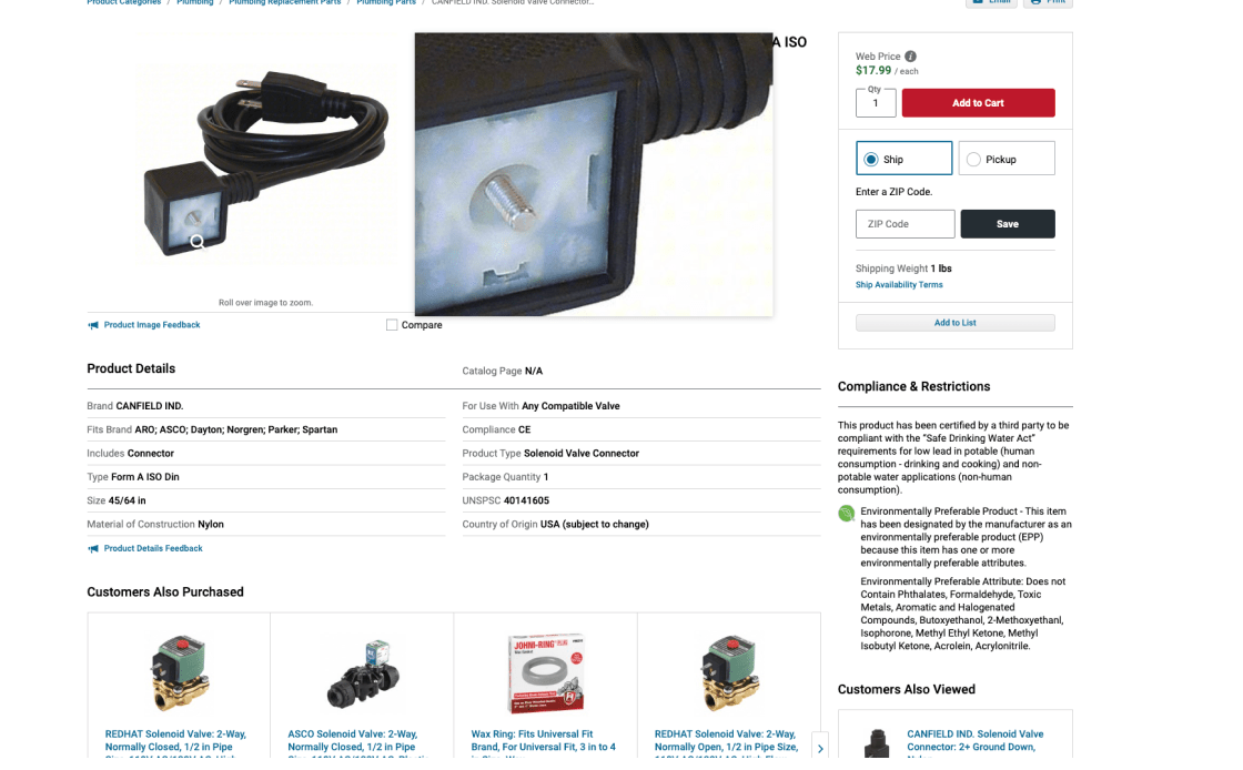
On Kohl's product pages, the "Add to Cart" button looks like a secondary one. The lack of contrast causes misclicks, as this design flaw increases friction and makes shopping decisions uncertain.
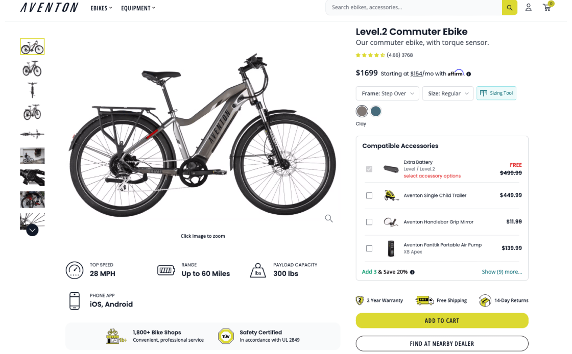
Aventon takes proper care of this problem. Their "Add to Cart" button is distinctly styled and clearly sets them apart. Users can easily identify the call to action and navigate smoothly towards a purchase without distraction or uncertainty.
The Product Price in the “Buy” Section Must Be Highly Visible
To improve the user experience and website sales, the product price should be clearly displayed in the 'Buy' section. This step is very important to help shoppers make informed choices and shows the site's honesty and transparency.
- Hard-to-see prices frustrate shoppers and may make them lose trust and give up on a purchase
- Prices that are too small or blend in too much can easily be missed
- Make the price stand out in the 'Buy' section with large, bold fonts and attention-grabbing colors
- Prevent other information from overshadowing the price by limiting the surrounding content
- Avoid implementations like "Tap for Price" that hide the price from immediate view
Use bold, large fonts and reveal the product price instantly. Users easily identify prices, which influences purchases and builds trust. Our experience shows users quickly lose interest in products with hidden pricing.
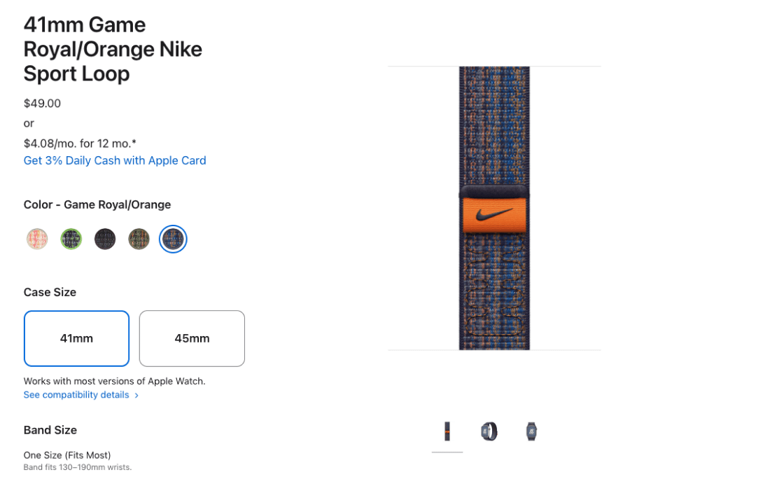
Apple's product pages lack pricing visibility due to the small font size and subtle color. This frustrates users and makes them dislike the page, as they feel misled and skip purchases.
Walmart's "Buy" section demonstrates effective pricing. Price is important in product evaluation, so this method fits user expectations. Transparent pricing reduces irritation, abandonment, and decision-making time.
Shipping & Returns
Shoppers find it easier to make decisions when 'Free Shipping' and arrival dates are clearly displayed next to the 'Buy' button. This way, they don't have to worry about shipping costs or delivery dates, which makes it easier to make choices. Don't be afraid to clearly communicate all the details related to price and shipping time, as this will make the buying process go more smoothly. It increases trust in your services, making online shopping easier and more enjoyable.
Make Sure "Free Shipping" Info is Within or Near the "Buy" Section
The clarity of the "Free Shipping" information next to the "Buy" button greatly influences whether shoppers will make a purchase. This is a very important segment of the process, and placing the information right where people are most likely to see it and decide to buy it is a must.
- Users frequently overlook "Free Shipping" when not clearly visible, wasting time searching instead of completing the purchase
- With "Free Shipping" information unclear or hidden, visitors figure out more secret costs, leading to mistrust and leaving the page
- Clearly display "Free Shipping" information in or near the "Buy" section of the product page
- Make sure the shipping information is easy to see so that users can immediately figure out the amount of savings
- Use short, clear wording - stay away from technical jargon and vague terms
Position 'Free Shipping' info near 'Buy' to ensure the highest visibility, aid decision-making, and increase the likelihood of completing a purchase.
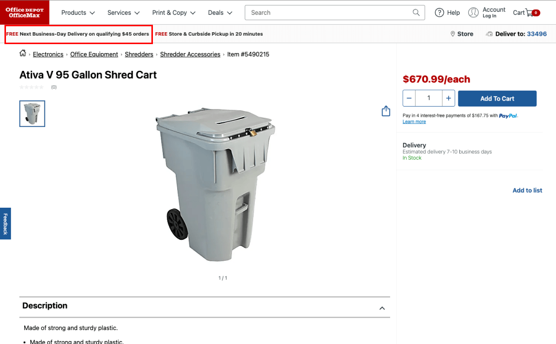
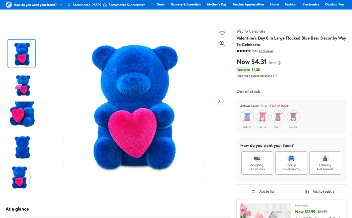
Office Depot's product pages lose a sales opportunity by simply promoting "Free Shipping" in the sitewide headline, which buyers overlook. Shipping costs induce hesitance to buy.
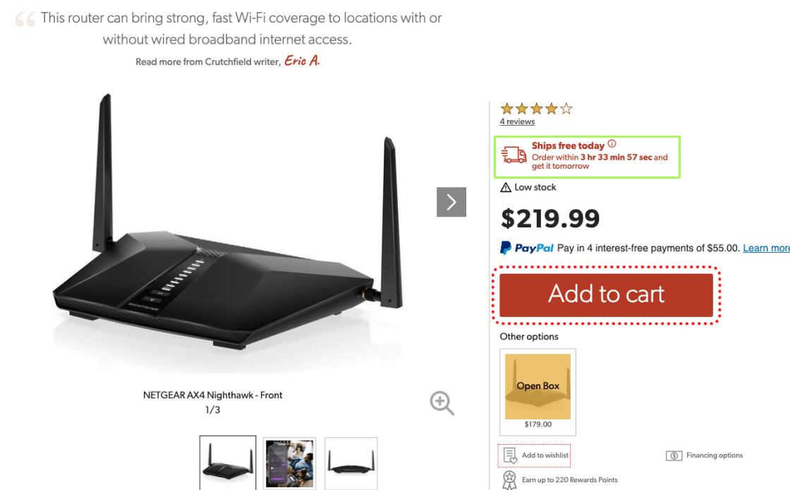
Crutchfield carefully positions "Free Shipping" above the "Add to Cart" button to avoid missing crucial details. This example solves a common user issue.
Insert Clear Delivery Date Information Near the "Buy" Section
To improve the service, being clear about delivery times near the "Buy" button is key. It addresses the most common concern - the actual delivery time of an order. People find it easier to shop when there are clear shipping estimates or a date range next to the "buy" button, so there is no need to "do math."
- Higher chances of giving up on the product due to uncertainty about the exact delivery time
- Relying on "delivery speed" forces users to manually calculate and guess the delivery date
- Show an estimated delivery date or range close to the "Buy" button to set clear expectations
- Use delivery-date estimators for precise delivery information
- Clarify that delivery dates on the product page are preliminary and may change at checkout
To improve consumer experience and trust, clarify delivery dates near 'Buy'. Make it clear that these are estimates that could change. Introducing a delivery-date estimator will improve accuracy.
HP product sites lack shipment, speed, and delivery estimates. This makes buyers guess the delivery time, even if they prefer knowing it before checking out, reducing their chances of making a purchase.
Shipping information on the Sears website is exemplary. Displaying the projected delivery date above the "Add to Cart" button boosts shopping transparency, reliability, and purchase likelihood.
Product Description
For a smooth eCommerce experience, it's important to make sure that the product is described in detail. Users will believe and be able to make better decisions about the product if its descriptions are clear and consistent across all versions. Some important tactics are to include important features in product headlines that are complete and easy to read. When product pictures are paired with such detailed and organized descriptions, users can quickly understand and assess the product and make a purchase more likely.
Provide a Detailed Product Description
Good product pages need clear, detailed descriptions for every variation, which is key to gaining shoppers' trust and reducing returns.
- When product descriptions lack key facts or don't answer their questions within 1–3 minutes, shoppers usually leave the site without making a purchase
- When descriptions don't match up or are unclear, shoppers are frustrated and less willing to buy
- Check the product descriptions often to make sure they show important product features and give all the information needed
- Make sure that product titles match up with pictures, explaining any unclear ones and going over the most important features
- Keep the structure and level of detail in descriptions of related products the same
Highlight informative descriptions along with clear product visuals to help users understand each item and be able to choose and compare for a more confident purchase and lower return rates.

Rollink's product pages lack quality details. A large block text without bullet lists makes essential features hard to understand, leading visitors to give up and go elsewhere for information.

Home Depot's product pages efficiently combine bullet points with detailed paragraphs. This gives shoppers a well-structured and thorough view, helping them understand the product and make a quality purchase decision.
Underline Key Product Features in Product Page Headlines
Headlines that quickly and clearly explain what the product is about are the first thing that makes a product page work. This helps people stay interested in and involved with the product.
- Headlines limited to product titles miss the chance to engage the users about the product
- The same goes with too-simple or complex headlines
- Vague or technical headlines confuse users and frustrate their shopping experience
- Put important features right after the product title in the headline
- Keep headlines clear and simple; avoid technical jargon
- Adapt the number of features in headlines based on the product's nature—fewer for visual products and more for those with complex specs
List the most significant features to make headlines clear, helpful, and in line with the product title. Users will have a clear image without reading the whole product page.
LEGO's product pages are confusing and lack headline features. Long wording hides key features. Users are unable to find a product's unique selling advantages or suitability.
Target's headlines put the most important features after the product name, making it easier for people to quickly understand what the product is all about.
Product Variations
Visual product presentation is key to a pleasant eCommerce journey. This includes distinct “cut out" and "angle" graphics to let visitors compare options. Choosing colors with swatches instead of drop-downs improves the experience. Swatches make colors easier to compare, and when they change, the object's primary image is changed. This simplifies the shopping process, resulting in positive and well-informed purchases.
Provide Unique Product Images with All Visual Variations
To improve the user experience on product pages, you should include a lot of visible information for each type of product. This approach is very important for giving users confidence in the things they buy.
- Without basic product images in their preferred variation, users guess the visual outlook of the product and lose confidence in your offer
- Showing images of unavailable variations confuses users and nudges them towards abandoning the website
- Offer unique "cut out" and "angle" images for each and every visual change; if not feasible, use text or captions to explain the product
- Keep images of temporarily out-of-stock variations with notes on expected restocking
Visualise each product variant in detail. This helps consumers assess their options, make informed choices, and avoid unmet expectation-related returns.
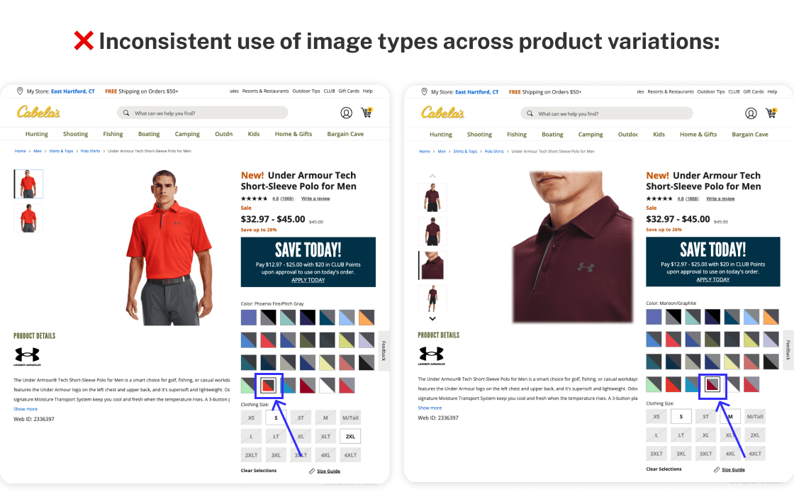
Cabela’s product pages show inconsistent image types for different variations, causing confusion. Without uniform images or helpful text for unavailable variations, users are often misled and may leave the site without buying.
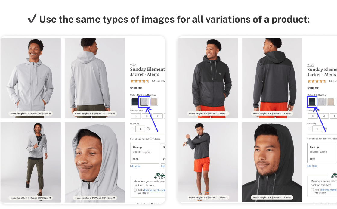
REI consistently uses image types across all product variations, benefiting user clarity and decision-making.
Always Use Color Squares for Product Color Previews
Color is a primary factor in user engagement with your products, so displaying all color options prominently helps them easily choose, improving trust in your offer.
- Users may not see all color options with drop-down selectors, missing preferred choices
- Even with custom selectors mixing text and swatches, finding and comparing colors remains a challenge
- Use swatches with color variation and make sure the main product image changes to the selected color
- Provide a quick preview of the color variation
- Take care of the "Back" button when switching swatches; it should either take users back to the last place before any change or to the beginning of the list of swatches
Display swatches beside the image for easy color picking. Use hover previews for quick views. This makes choosing and comparing colors easier, making the purchase more fun.
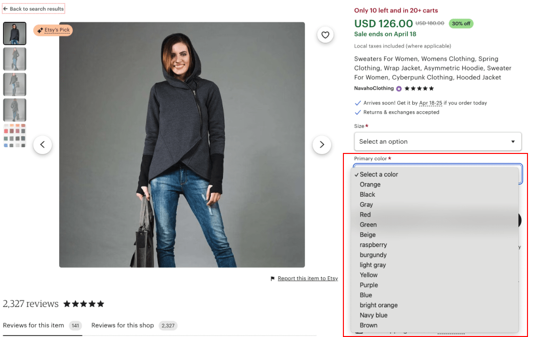
Etsy's drop-down color options make navigation difficult since customers think only the default hue is available. The main product image is the same regardless of the chosen color.
Target's pages show color variations well by comparing swatches. The hue changes the product image. This simplifies product selection, avoids complexity and eliminates guesswork.
Customer Reviews
This section covers the importance of user-submitted images for showing the real product, how a ratings overview chart can help with quick, well-informed evaluations, and how a "Load More" button can help with an in-depth review study. These strategies make the review process better by giving users honest, thorough, and simple feedback, which is important for making smart choices and turning customers into satisfied shoppers.
Encourage Users to Submit Their Images as Reviews
Adding pictures uploaded by users to product reviews is a great way to make your eCommerce site seem more real and trustworthy. These pictures show items in a more realistic way than professionally taken site pictures often do, and they give you useful information about how to use the product in real life.
- People are often skeptical of site photos that they deem overpolished
- In the absence of real-life images, users may not be able to get a good idea of a product's true look and quality
- Encourage customers to share pictures of their products with reviews so that people can get a real look at them and build trust
- Make it easy for users to upload and show their reviews; use both automated and manual checks to make sure images are relevant and suitable
- Offer rewards for picture submissions; first-hand experiences will increase the visibility of your product
Make it easy (and profitable) for customers to post pictures with reviews and place them in a prominent position on the product page. This will improve the quality and reliability of your eCommerce offer.
Due to the lack of customer pictures, Rollink's reviews are partial. Visitors can't see examples of items in real life, as user-generated photos show details that professional ones don't.
Lowe's pages can feature review pictures. They feature UGC (User Generated Content), present how items look in real life and bring out details that professional shots miss, building credibility and trust.
Introduce a Rating Distribution Chart at the Top of the Review Section
Users are more likely to trust reviews if there is a rating distribution chart at the top of the review section on product pages. Having a visible summary of customer feedback gives you a full picture of how well the product performs and helps you make informed choices.
- Reviews without context can mislead users about a product's overall rating
- Lack of a rating distribution chart may raise doubts about the authenticity of reviews
- Ratings that only show the average score of multiple reviews are insufficient
- Display a visible rating distribution chart for products with at least five reviews
- Ensure the chart is distinct from the main content to avoid confusion
- Use a clickable chart for small catalog sites to underscore review authenticity
Place the rating distribution chart prominently so that users can quickly view a visual summary of reviews and assess the product's quality and popularity.

Etsy's reviews lack a ratings chart, casting doubt on the authenticity of positive feedback and influencing user trust and purchase decisions.
Dell displays a rating distribution chart by default. Users can clearly see how ratings are distributed, boosting transparency and confidence.
Show At Least 5 Reviews With an Option to 'Load More'
Optimizing the product review process is crucial for your eCommerce business. Adding a "Show More Reviews" button strikes a good balance between the need for easy access to detailed reviews and the importance of simple navigation.
- Showing too few reviews stops people from exploring, finding patterns, or getting answers to specific questions about a product
- Too many reviews are confusing, and users will barely get to the information or links below them
- Pages in review sections discourage users from examining comments and engaging with the product
- Display at least five reviews by default so that users can easily look around and find patterns of trust
- Instead of pagination, "Load More" buttons work better because they add more reviews to the same page, reducing friction and wait time
- If all of a product's reviews are shown by default, the "Load More" button should be removed so that users don't get confused and waste time clicking
To get users to check out your products more, include a "Show More Reviews" option without leaving the current page. Remove it once all reviews have been shown.
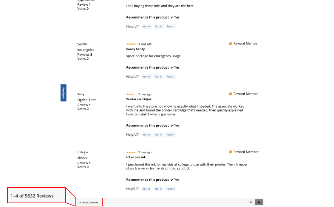
Office Depot displays only 4 customer reviews. It requires visitors to click to load more reviews, which complicates browsing reviews and reduces user confidence.
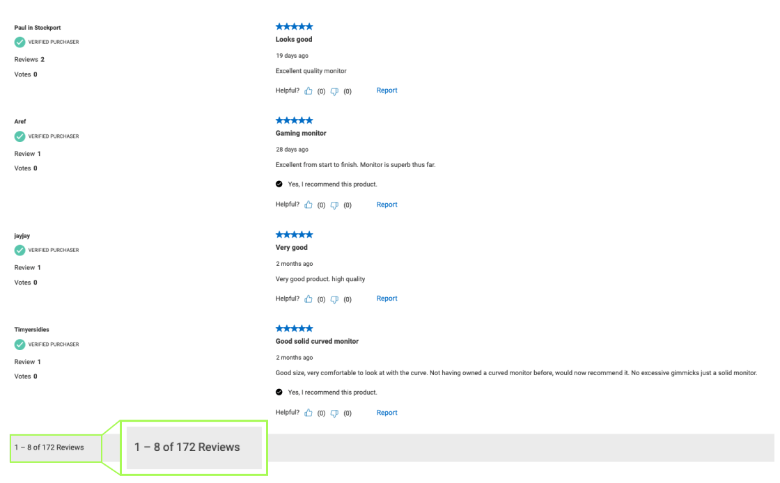
B&H Photo shows 8 default reviews, offering ample comparison. A 'Load More' button balances detail and user engagement.
Cross-Selling Suggestions
Adding dedicated sections for alternative products with explicit "Add to Cart'' choices for extra items optimizes cross-selling on your website. These user-friendly alternative product sections allow consumers to identify and compare similar items, improving decision-making for more frequent purchases.
Introduce a Cross-Selling Section for Related Products
Helping users find the item they need is a crucial segment of sales. In addition, our experience shows that a special section for related products on each page, other than increasing sales, makes it easier for shoppers to explore options without going back and forth.
- When a user finds a product that doesn't meet all of their needs, finding better options in a large catalog is challenging
- It is frustrating to switch between product pages and the product list or search results, especially without sorting options
- On each page, include a clear list of alternative products to keep customers engaged
- The cross-sell area should only have alternatives that are clearly marked and described, making them more relevant
- Carefully place the cross-sell area with a link to the main category so that it's seen as an extra resource rather than a conclusion
Introduce a clear, separate website section for related products so that users can compare options without leaving the product page. This improves the user experience and increases sales.
Rollink's page lacks a cross-sell section, and users seeking alternatives must repeatedly navigate back to product lists or search results.
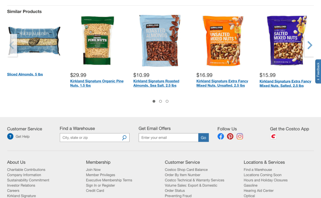
Costco's "Similar Products" cross-sell section offers alternative items, removing excessive navigation, aiding in upselling, and guiding users towards other choices.
Expand the "Add to Cart" Function for a Number of Supplementary Cross-Sells
On product pages, you can increase your sales by adding straight "Add to Cart" buttons to some cross-sell items. Items closely related to the main product and not requiring additional research benefit the most from this approach.
- Browsing additional product pages can be time-consuming and without result
- Users may miss out on relevant additional products due to navigation issues
- Offer the "Add to Cart" cross-sell buttons for low-cost extra buys that depend on the main product or don't need much research
- Make the cross-sell "Add to Cart" button look and read differently from the main product one
- Don't use this option for cross-selling alternative products
Make sure the "Add to Cart" buttons for cross-sells look different from the main product's button to improve the shopping experience and increase the average order value.
Newegg has an "Add to Cart'' cross-sell button that matches the main product, which can cause user confusion and decrease the level of completed purchases.

B&H Photo's product description page efficiently implements this, helping consumers add additional goods to their cart without mistaking them for the main product.
Homepage & Category Navigation CRO Guidelines
In this section, we focus on key areas that are essential for optimizing your homepage and category navigation. Each category is designed to tackle a specific aspect helping you increase conversion rates:
Concentrate on presenting a broad selection of products and place ads strategically to immediately engage users.
Improve the clarity and utility of the main navigation to help users quickly locate products.
Simplify the structure of product categories to assist users in efficiently navigating through them.
Homepage
As obvious as it may seem, it is often forgotten that the homepage is the initial point of contact for your customers. It highlights product variety, brand principles, and aids in navigation. In this section, we will discuss how to communicate a wide range of products, strategically position ads, improve navigation, and highlight important product and brand features. Together, these elements create a user experience that is both interesting and educational from the beginning. Remember, the homepage is more than just a way to get to the site; it's an interesting tool to keep users interested and build trust.
Display a Wide Variety of Product Types on the Homepage
We've noticed an important pattern in eCommerce: showing a lot of different types of products on the homepage makes it much easier for people to understand what the site is all about. This is very important for first-time users.
- Showing too few products on the homepage misleads users about your site's variety, prompting them to miss what's on offer
- First-time visitors will especially opt to leave the site if they don't see their desired item immediately, leading to lost sales
- Ensure a wide selection of products is featured on the homepage to give a true sense of the site's variety
- Consider showing nearly half of all product types on the homepage for a thorough overview
Use a mix of product images and category thumbnails to keep the layout of the homepage balanced. This visual approach works especially well for showing the site's product range.
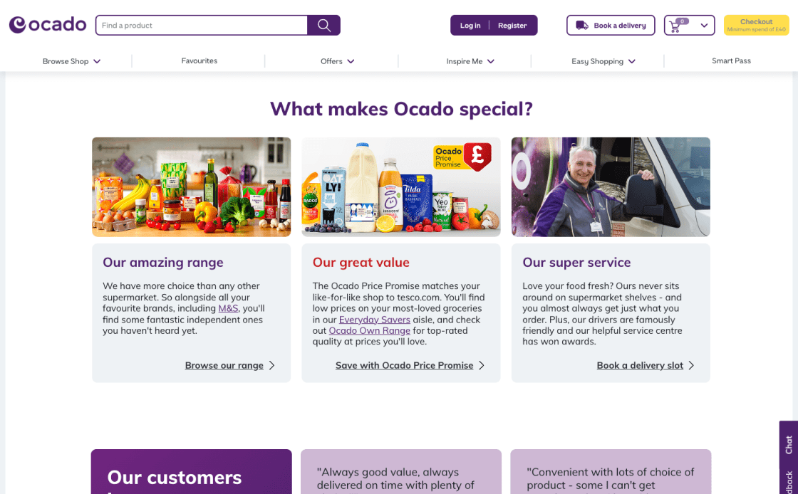
Ocado's 13 categories aren't shown on the homepage, first-time users might not realize how varied the site is, impacting customer engagement and sales.
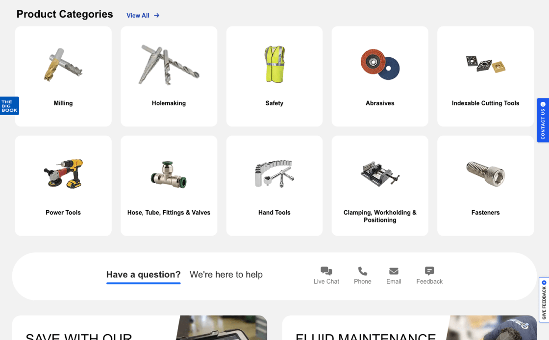
MSC Industrial Supply does a good job displaying 12 categories, or approximately half of its offerings. This provides a clear and complete picture of what they offer, increasing sales.
Be Careful When Displaying Ads on the Homepage
Balancing ads on the homepage is key; they should inform, not overwhelm. Strategically placing ads in limited screen space helps avoid distracting users who are just beginning to explore the site.
- Homepage ads, especially those excessively distracting like pop-ups, make a bad first impression and complicate user navigation
- Users often confuse internal deals with ads from outside the site, which makes the navigation even more problematic
- Place ads subtly, ensuring they do not overshadow the main content
- Don't use overlays and pop-up ads that interfere with the user experience
Make sure that the ads on the homepage fit in with the overall look of the site. Make sure they add value without taking away from the user experience, as every pixel of the user’s screen matters.
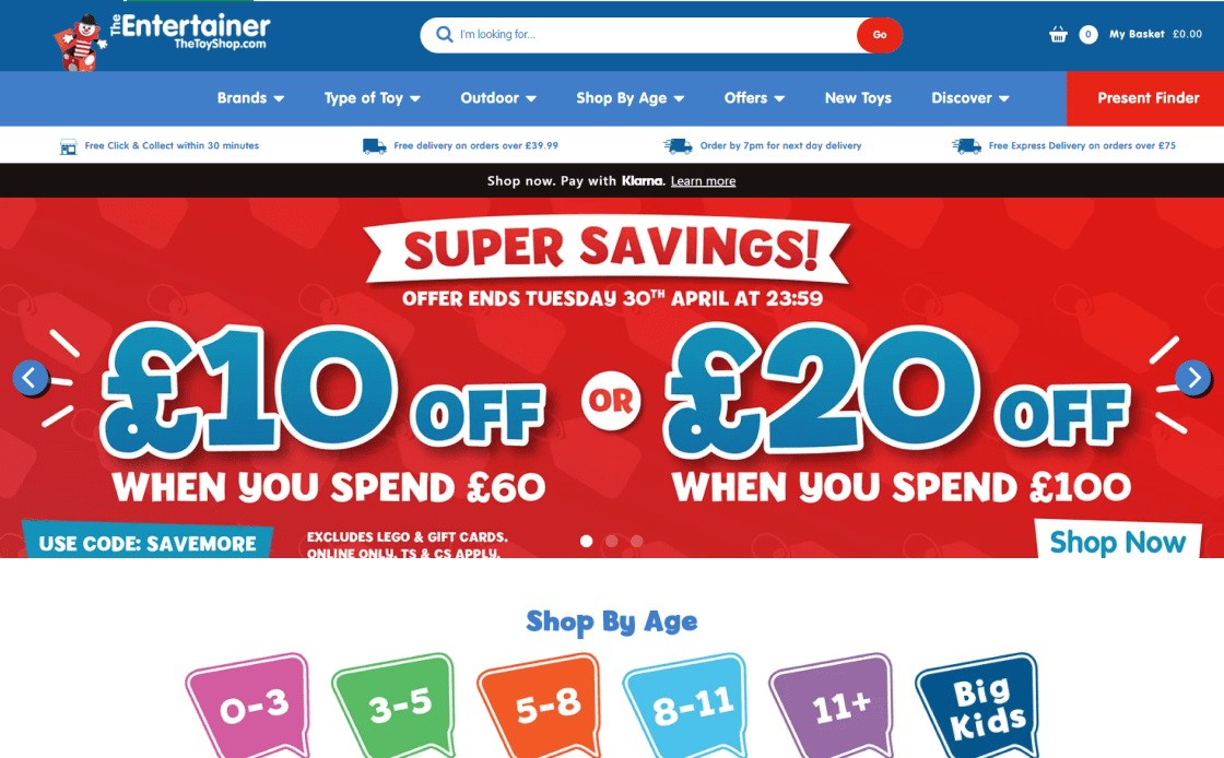
With “ad-looking” content in prime areas, TheToyShop.com homepage risks overwhelming customers, with products effectively hidden. This frustrates users and increases site abandonment.

The Microsoft homepage is free of distracting ads in key areas for navigation and purchasing. This simplifies the user experience and keeps them interested in the site's products and services.
Indicate Where the Hit Areas in Visual Elements Lead
For a smooth site experience, making it easy for users to find and connect with clickable areas improves ease of use. If clickable areas aren't clear, especially if they have both text and graphics, it can be hard to tell where links lead, which can lower trust and slow down navigation.
- Unclear hit areas in visuals often confuse users and lead to navigation errors
- Ambiguity in interactive elements risks detours or missed opportunities, potentially resulting in product and site abandonment
- Use hover effects and styling to clearly demarcate hit areas
- Make it clear whether a visual element goes to a single or several different locations
Make sure visual clues match hit locations by using synchronized hover effects, borders, and background colors so users can easily locate each clickable element.
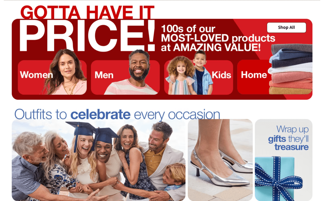
JCPenney's homepage presents visual elements that ambiguously suggest multiple destinations, creating confusion for users, leading to navigation errors and more frequent site abandonment.
Hover effects on Sports Direct's site identify which visual elements go to which destinations. This design makes clicks obvious, improving navigation and the user experience.
Emphasize Key Features of Products and Brands on the Homepage
The homepage showcases key product and brand aspects and should establish a company's originality and reliability, especially for new visitors. A site that emphasizes product specifics and company values builds trust and interest, encourages further investigation, and reduces the risk of customers finding the brand uninteresting.
- Besides the product catalog, users quickly assess a site's policies, value proposition, and trustworthiness by examining the homepage
- Lack of clarity on these issues can lead to early abandonment
- Communicate core product features and brand benefits on the homepage using clear, concise language and engaging visuals
- Users can be drawn to and understand content using subheadings, bullet points, borders, shading, or icons
- Make sure important policies like free shipping and return information are stated to build trust and encourage exploration
Present 2–5 key product attributes on the homepage using text, photos, and gifs. Use an informative yet simple approach. Bullet points, icons, and subheadings will make text easily readable.
Evarlane's homepage leaves out product features and brand values, resulting in user confusion, a lack of connection with the brand, and premature site abandonment due to distrust.
KiwiCo's webpage highlights product characteristics and brand values. The layout is easy to scan, so users can swiftly understand the brand's distinct offerings and credibility.
Main Navigation
Main Navigation is like a road map for people who want to find their way around your site. It's where you can start looking for products because it shows the categories clearly, separates the welcome navigation, and draws attention to the current scope. This section is all about making the main navigation work better so that users can easily find the products and details they want. This will increase user engagement and make the user experience better overall.
Clearly Indicate the Current User’s Position in the Navigation Menu
Knowing where they are in a site's hierarchy helps users navigate and learn how it's arranged, especially for those arriving from an external search. Effective navigation is a key element of a user-friendly website.
- Not knowing where they are in the site's order makes users feel “lost", disoriented, and unwilling to explore the offer
- Inconsistent or missing breadcrumbs further complicate user navigation and lead to frustration
- Use text style, contrasting colors, and other visual elements to make the current main category stand out in the main navigation
- Make sure the important main navigation option stands out, even if the groups are grouped together under one menu item
Change colors, add bold text, or add icons to show current navigation. The active area should be visible even in collapsed navigation menus to give users a sense of confidence when surfing the site.
In its primary menu, Evo's website lacks breadcrumbs and scope indications. Users may be more likely to abandon the site due to confusion about its navigation.
Highlighted navigation and breadcrumbs assist users in navigating ASOS's website. New or externally linked users especially benefit from this dual method.
Make Product Categories the First Level of the Main Navigation
Displaying product categories as the first level of the primary navigation is an important sales tactic. This strategy not only speeds up product discovery, but also gives users an immediate understanding of the site's product range and scope.
- Concealing product categories behind a single menu item can slow down product finding
- Users can't easily figure out the site’s offer when top-level product categories are hidden
- Display product categories directly in the main navigation for immediate visibility
- Reserve the main navigation for product categories, using secondary menus for other content
- Avoid non-product navigation in the main navigation bar
Product categories should be the primary level of desktop navigation, as this visibility helps users understand the site's offerings immediately. In secondary menus, add non-product links.

HP's main navigation doesn't feature product sections on the first level, making it hard to understand the site's offer. New users find scrolling less intuitive.
Apple's main navigation excels by showing product categories first. This lets customers promptly understand the site's nature and product line-up, making browsing easy and UX-friendly.
Visually Split Sitewide Courtesy and Main Navigation
The clarity and organization of a website's navigation are crucial. Users primarily visit these sites to browse and purchase products, but they also often need quick access to nonproduct-related information. This is where the concept of separating sitewide courtesy navigation from the main product navigation becomes vital.
- The main navigation can get crowded with courtesy navigation, which can distract users from their main goal
- Users struggle to find product categories as there are nonproduct links, creating distraction
- Make a clear visual difference between courtesy and main product navigation
- Group courtesy links thematically and consider using drop-down menus for a cleaner look
- Introduce "Sign In," "Create Account," "Help," "Contact/Customer Service," "Track an Order," and similar site-specific choices as courtesy navigation options
To improve site navigation, display courtesy navigation above the product menu, use contrasting background colors, or group related items. This makes product categories and ancillary services (like customer support) easy to identify and discern.
Lego's main menu combines product and courtesy links, making it crowded. These undefined navigation zones overwhelm users, potentially driving them away from the website.

Different font styles and background colors identify courtesy options from product categories in Marks & Spencer's main menu. UX is simplified, and browsing is faster.
Category Taxonomy
The category taxonomy is an important part of any online business. Sites can follow all the rules in the Homepage and Category Research theme for the most part, but users will still have trouble finding items on the site if the category taxonomy is off. This section explains how to improve navigation with shared attribute filters, use clear and consistent category language, and improve the user experience with a filter-based "Sales" category. All of these parts work together to make it easy for users to find and compare goods, find their way around, and find deals.
Use Shared Attributes as Filters, Not Categories, for Product Types
The way items are sorted and organized is a very important part of the user experience in eCommerce. Our insights show that it is much easier to find products when product types with similar attributes are used as filters instead of separate categories.
- If product types are put in the wrong categories, users may spend too much time evaluating items and miss the preferred ones
- When products with shared attributes are categorized as separate ones, it makes it harder for users to find them, leading to frustration and increased site abandonment
- Use product types as filters instead of categories when most product attributes (e.g., “brand”, “size”, or “style”) are the same across the product type
- This practice shows users a wider range of related items that they might not have thought of before
Group products by brand, size, or style under a single filter. This strategy saves time and introduces a broader range of relevant products to users, leading to improved sales.

Backcountry's product sub-type implemented as categories slow product discovery and drive users away from the site.

ACE Hardware optimizes UX with product sub-type filtering. Users can find all related products in one list, reducing the need to browse categories. Mutually exclusive product types are also wisely categorized.
Use Explicit and Universal Category Terminology
Clear and understandable names of site categories are important for easy navigation. Users get confused when groups use unclear or site-specific language, which makes it harder to find products. Users, especially new ones, need to be able to easily see the different types of products and catalogs on a site. The main navigation's visibility is a critical factor in how well users understand the product range.
- Category names written in industry jargon confuse visitors and cause them to miss out on great offers
- Site-specific terms used to describe product groups make it hard for visitors to explore all available products
- Use universally understandable category names and avoid industry-specific language whenever possible
- Clear, consistent names for all site categories and subcategories, with thumbnails and brief explanations, will increase user engagement
Use descriptive language to name site categories. This simplifies buying for non-business people. Site-wide category names boost user confidence and product understanding.
Guitar Center's category titles may confuse non-specialists with industry terms. This approach risks users missing quality purchase options. This lowers user confidence and repels customers.

UX is optimal at Hamleys’, with descriptive and understandable category titles. Regardless of their brand or sector knowledge, users may quickly navigate the website.
Introduce 'Sales' or 'Deals' Filters as a Category for Easy Access
If popular, every filter can be paired with its related product type to establish a filter-based category featured in the main menu or homepage. Our expertise shows that “What’s New” and “On Sale” are two filter-based categories preferred by consumers. This simplifies discovering deals by making it easy to explore sale items without having to navigate through categories.
- Users often struggle to find items on sale due to poor categorization
- However, visitors won’t be able to see the full range of products if attributes like "On Sale" are set up in different categories
- Introduce a filter-based "Sales" category, but as a preapplied filter, not a separate category
- Depending on product list size and visibility, implement the "On Sale" filter-based category at the top or within relevant subcategories
- Implement a comprehensive 'On Sale' filter at both top-level and subcategories to manage extensive product lists effectively
Instead of a category, a "Sales" or "Deals" filter simplifies shopping for broader product lists. This simplifies product comparison and selection. It should be applied uniformly to all product groups.
The GAP website's "Sale" category doesn't filter. The "Sale" subcategory limits the options for discount shoppers and users selecting sale and non-sale items.
Evo's website's "Sale" filter enables shoppers to easily find discounted products. This feature is user-friendly because of its popularity in finding offers.
FAQ
We will provide you with a list of problems and solutions—opportunities to improve your conversion rate.
You will also receive a complete CRO strategy with enough A/B tests for 3-6 months.
Here is an example of the audit we conducted for the Rollink website.
A good eCommerce conversion rate typically ranges between 2% and 3%, but don't be mistaken—this number can significantly vary based on factors like your industry, what you're selling, and who's buying. Sites nailing their CRO strategies can often push past these averages, achieving even better results.
To calculate your ecommerce conversion rate, divide the number of conversions (actions like purchases) by the total number of visitors, then multiply by 100 to get a percentage. For example, if your store gets 500 visitors and 10 of them make a purchase, your conversion rate would be (10 / 500) * 100 = 2%.
Reduce distractions and enable autofill to speed up the checkout process. Use jump points to make navigation easier, as well as A/B testing to get the most out of group filters. Make it easy to reorder, keep the cart's interface simple, and use strong calls to action to get people to finish. Limit the number of options so that users don't feel overwhelmed, and personalize exit intent strategies to send personalized texts or offers to people who might be leaving.
Although there is not a definitive answer, consider highlighting limited availability to prompt quick purchases, using customer testimonials and reviews to educate and build trust, displaying security badges to reduce transaction friction, providing clear and compelling CTAs, offering live chat support, providing high-quality images and videos, and regularly performing comprehensive audits to identify and fix conversion barriers.
Several factors can affect eCommerce conversion rates, including website design, user experience, product pricing and quality, traffic source quality, and seasonal trends. Personalizing content and offers to meet the needs and preferences of your target audience also plays a significant role.
Absolutely! Think of SEO and CRO as a dynamic duo for your website. SEO gets your site seen by helping you rank higher in search engine results. CRO, on the other hand, is all about what happens once visitors land on your page. It focuses on getting those visitors to take action, like buying your product or signing up for newsletters. Without SEO, you’d have fewer visitors to convert. Without CRO, traffic might not translate into valuable actions.
While PPC is fantastic for driving traffic to your site, focusing solely on it without leveraging CRO might mean you're not making the most of that traffic. CRO is crucial for optimizing the user experience once visitors arrive, helping to convert clicks into customers. It complements PPC by maximizing the effectiveness of your ads and lowering overall acquisition costs. In essence, PPC brings in the visitors, and CRO makes them stay and purchase. Ignoring CRO could mean missing out on maximizing your PPC efforts.