Styleguide
Typography
*Note: Figma set up has Desktop, Tablet and Mobile side by side.
On Webflow we need to adjust Fonts on specific brakepoints.
Upload & Apply Fonts

Trap
Global Styles
Jumbo H
Jumbo H
Heading 1
Heading 2
Heading 3
Heading 4
Heading 5
Heading 6
We try your eye, but can you change everything? in an ideal world nor can we try some other colours maybe just do what you think.
We try your eye, but can you change everything? in an ideal world nor can we try some other colours maybe just do what you think.
We try your eye, but can you change everything? in an ideal world nor can we try some other colours maybe just do what you think.
We try your eye, but can you change everything? in an ideal world nor can we try some other colours maybe just do what you think.
Caption
Label
We try your eye, but can you change everything? in an ideal world nor can we try some other colours maybe just do what you think.
We try your eye, but can you change everything? in an ideal world nor can we try some other colours maybe just do what you think.
We try your eye, but can you change everything? in an ideal world nor can we try some other colours maybe just do what you think.
Block Quote
- This is a dog
- This is a dog
- This is a dog
- This is a dog
- This is a dog
- This is a dog
Heading 1
Heading 2
Heading 3
Heading 4
Heading 5
Heading 6
What’s a Rich Text element?
The rich text element allows you to create and format headings, paragraphs, blockquotes, images, and video all in one place instead of having to add and format them individually. Just double-click and easily create content.
Static and dynamic content editing
A rich text element can be used with static or dynamic content. For static content, just drop it into any page and begin editing. For dynamic content, add a rich text field to any collection and then connect a rich text element to that field in the settings panel. Voila!
How to customize formatting for each rich text
Headings, paragraphs, blockquotes, figures, images, and figure captions can all be styled after a class is added to the rich text element using the "When inside of" nested selector system.
.jpg)
“Lorem ipsum dolor sit amet, consectetur adipiscing elit, sed do eiusmod tempor incididunt ut labore et dolore magna aliqua. Ut enim ad minim veniam..”
- Item 1
- Item 2
- Item 3
- Item 1
- Item 2
- Item 3
Global Background Classes
Primary / Midnight
Secondary / Cloud
Secondary / Sapphire
Neutrals
Neutrals Alt
States Colors
Text Colors
Global Text Colors
Back-end of third quarter pushback.
We try your eye, but can you change everything? in an ideal world nor can we try some other colours maybe just do what you think.
Neutral Text Colors
Back-end of third quarter pushback.
Back-end of third quarter pushback.
Back-end of third quarter pushback.
Back-end of third quarter pushback.
Brand Text Colors
Back-end of third quarter pushback.
Back-end of third quarter pushback.
Back-end of third quarter pushback.
Buttons
Inputs
Note, please copy the code from Page Settings only on the pages that will include forms in order to have all custom forms working properly.
Container
Section
Example Set Up for a Default Section
Combo Classes
*Note: Figma set up has Desktop, Tablet and Mobile side by side. On Webflow we need to adjust Fonts on specific brakepoints.
Paddings
Margins
Back-end of third quarter pushback.
Back-end of third quarter pushback.
Back-end of third quarter pushback.
Back-end of third quarter pushback.
Back-end of third quarter pushback.
Back-end of third quarter pushback.
Back-end of third quarter pushback.
Back-end of third quarter pushback.
Back-end of third quarter pushback.
Text Alignment
We try your eye, but can you change everything? in an ideal world nor can we try some other colours maybe just do what you think.
We try your eye, but can you change everything? in an ideal world nor can we try some other colours maybe just do what you think.
We try your eye, but can you change everything? in an ideal world nor can we try some other colours maybe just do what you think.
Container
Flex Overrides
Global Classes
*Note: Figma set up has Desktop, Tablet and Mobile side by side. On Webflow we need to adjust Fonts on specific brakepoints.
Column
Button Wrapper
Example of the column class
Pretty handy for positioning in the grid.
Main Wrapper
Icons
Swiper
CMS Collections Set Up
Overflow Hidden
Relative
Z 99
eCommerce Homepage & Navigation Guidelines
For mobile-specific tips on optimizing your product page, check out Practical eCommerce CRO Guidelines for Mobile.
In this section, we'll explore essential strategies for optimizing three important areas of your eCommerce website: the Homepage, Main Navigation, and Category Taxonomy. Each area is very important for directing and influencing user behavior and determining your site's conversion rates.
Sets the tone for the rest of the site and is meant to engage customers and guide them to the most important segment areas
The core of your digital offering. Its purpose is to provide a clear, easy-to-understand customer journey throughout the product catalog, making their purchase journey successful
The groups of products on your website, making it easy for users to find and get to the items they want.
Product Page CRO Guidelines
We've seen that using Vertically Collapsed Sections on product pages can significantly impact user experience. This layout makes it easier for users to quickly get an overview of all content, without the need to scroll through the entire page.
Consider Using Collapsible Sections for the Product Page Layout
We've seen that using Vertically Collapsed Sections on product pages can significantly impact user experience. This layout makes it easier for users to quickly get an overview of all content, without the need to scroll through the entire page.
- Lengthy, uncollapsed sections make it difficult for users to swiftly read the product pages
- Mixed use of collapsible and non-collapsible sections leads to navigation issues
- Implement collapsible sections across the board for a neat, easy-to-navigate layout
- Each collapsible section should have distinct, clear titles to help users find what they need
If you're using collapsible sections, ensure all content types like descriptions, reviews, and specifications are uniformly collapsed for consistency.
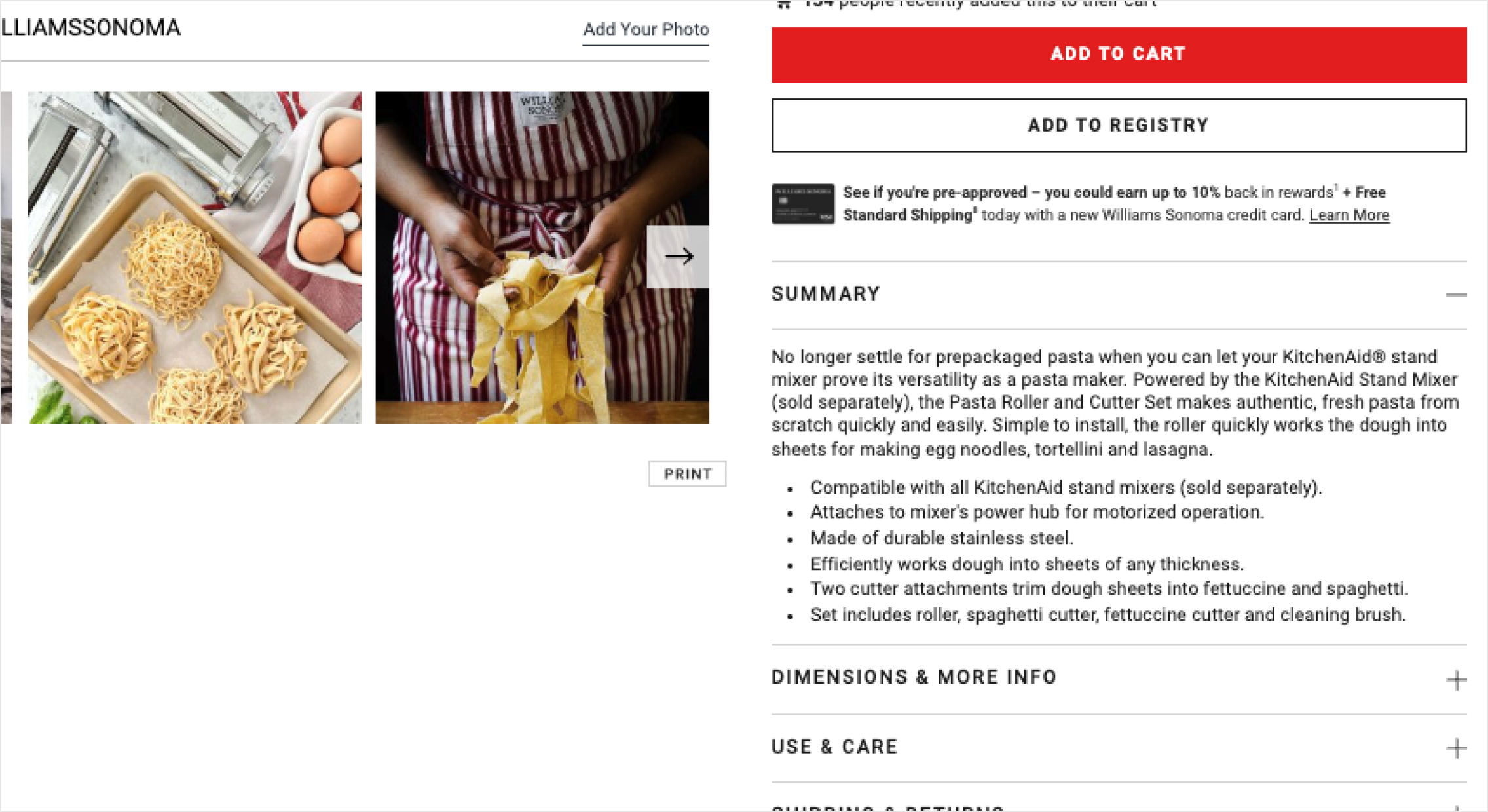

Large cross-sell images overshadow collapsible sections in the hero area at Williams Sonoma's PDP. Users might miss crucial details like Use & Care or Dimensions. Scrolling further reveals key details, like user reviews.
.svg)
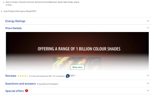
Argos uses collapsible sections for key page content, so users can quickly scan what's there and read what interests them. Tip: Display the review number and star overview.
Guides we wrote for you
In case you would like to increase conversion rate, our guides are a good place to start.

.png)


.png)